FunnelSystems DesignProduct Strategy
They weren’t unconvinced. They were undecided.
The brief was the enrolment flow. But revenue needs both halves: the right people arriving, and a funnel that can hold them.
Design Manager
2 designers + 1 PM
6+ months, two phases
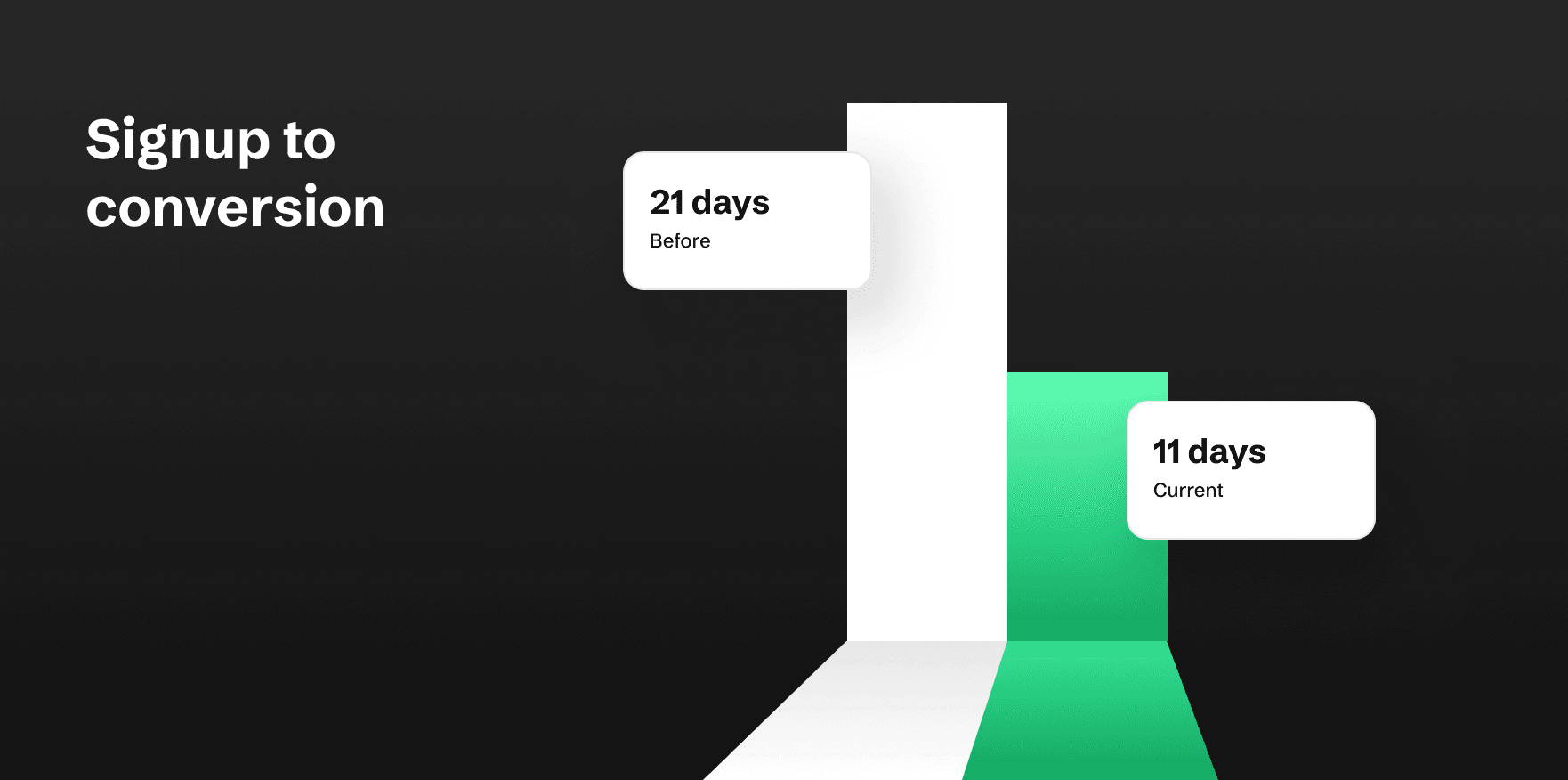
21 days → 11 daysAverage signup-to-conversion, after the launch
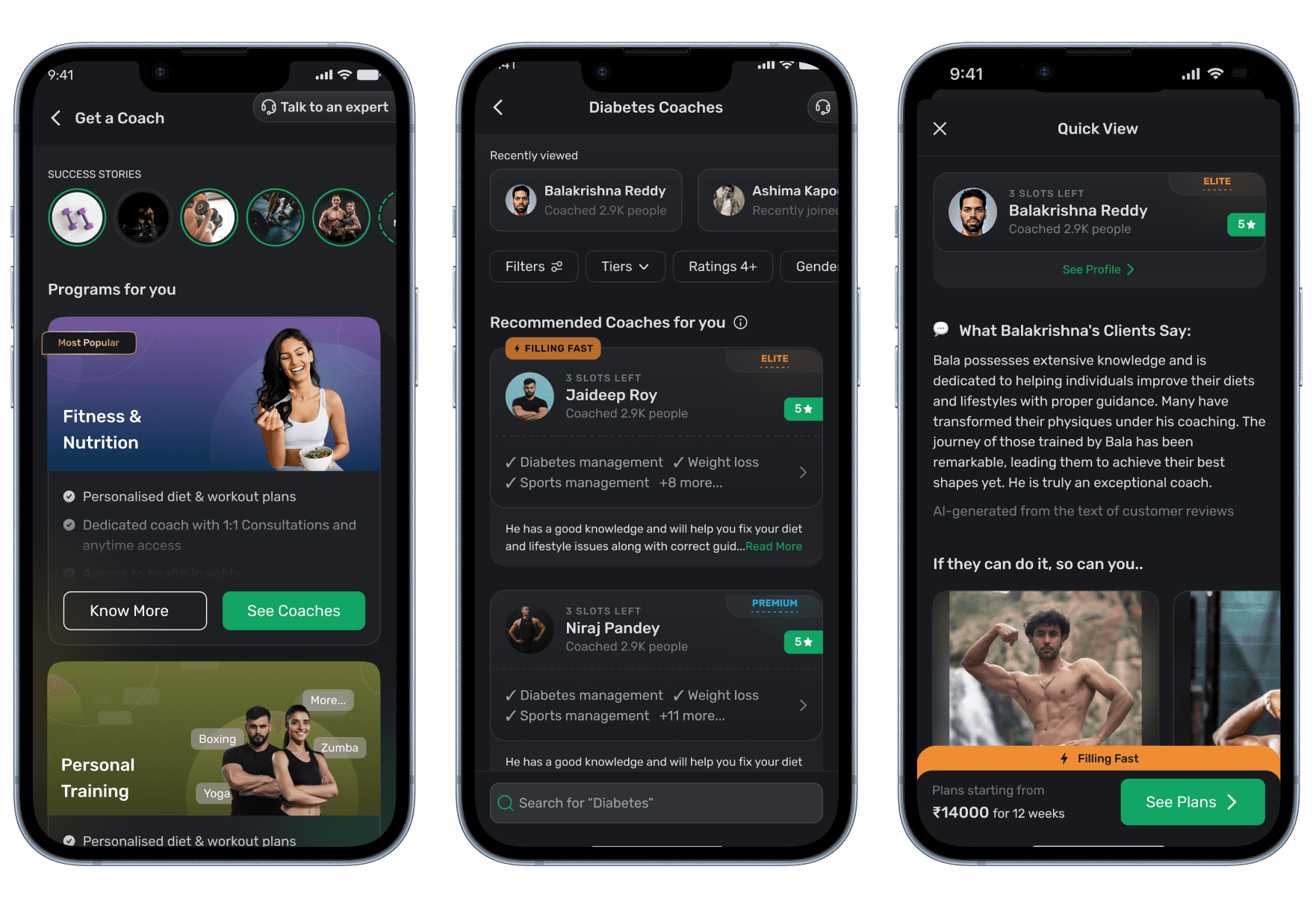
01 — The brief
Increase revenue. Improve the coach enrolment flow.
Revenue was falling.
The brief was specific and it was right. Management named the outcome and the mechanism, and they had the mechanism correct. The ambiguity sat one level down. Nobody knew why people were leaving.A consumer fitness platform where the coach enrolment funnel was the primary revenue path. This wasn’t a peripheral feature. It was the commercial spine.This wasn’t a growth optimisation. The business was losing money while the funnel underperformed. That explains the phasing that follows, and why we had to ship before we could measure.02 — The method
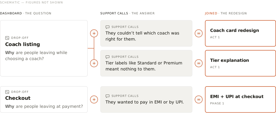
Analytics knew where. Support knew why. Nobody had put them side by side.
Drop-off data showed where people left, but not why. Support’s call-back conversations had the answers. On the payment screen, analytics recorded the drop-off; support heard people asking for EMI and UPI. Together, the location and the cause made a diagnosis: a missing payment method, not a price objection. Joining the two sources turned each drop-off into a redesign.
What a coach marketplace should have taken from Practo
| Practo | FITTR, before | |
|---|---|---|
Card design | Credentials, specialisation and volume, all on the card | Name, photo, rating, level and experience |
Information display | Enough to shortlist without opening a profile | Shortlisting required opening every profile |
Reviews | Can be filtered, sorted, and linked to a condition. | Unstructured. You could not find the review you needed |
50+Support conversationsWith the team who hear the problem every day, attaching causes to specific screens
25+Community postsUsers complaining in the FITTR Facebook community without being asked
Competitor teardownsCard design, information display, checkout and success screens
I ran no user interviews on this project. The user-side evidence was support conversations and community posts. Nobody was asked to complain, which usually makes for more candid reading than a moderated session.
03 — The insight
They weren’t unconvinced. They were undecided.
People weren’t abandoning because they doubted coaching. They stalled on the listing screen because nothing on it answered the only question that mattered. Is this the right coach for me?The instinct with drop-off is to remove steps. That would have been wrong here. A long time on screen followed by an exit is the signature of indecision, not friction. You fix indecision with better information at the moment of choice, not with fewer screens.Showing what was missing is more persuasive than describing it. Four things a decision needed. None of them were on the card.
- 1.No specialisation. Nothing said what this coach was for.
- 2.Reviews existed, but not where the choice was being made.
- 3.No way to compare one coach against another without opening both.
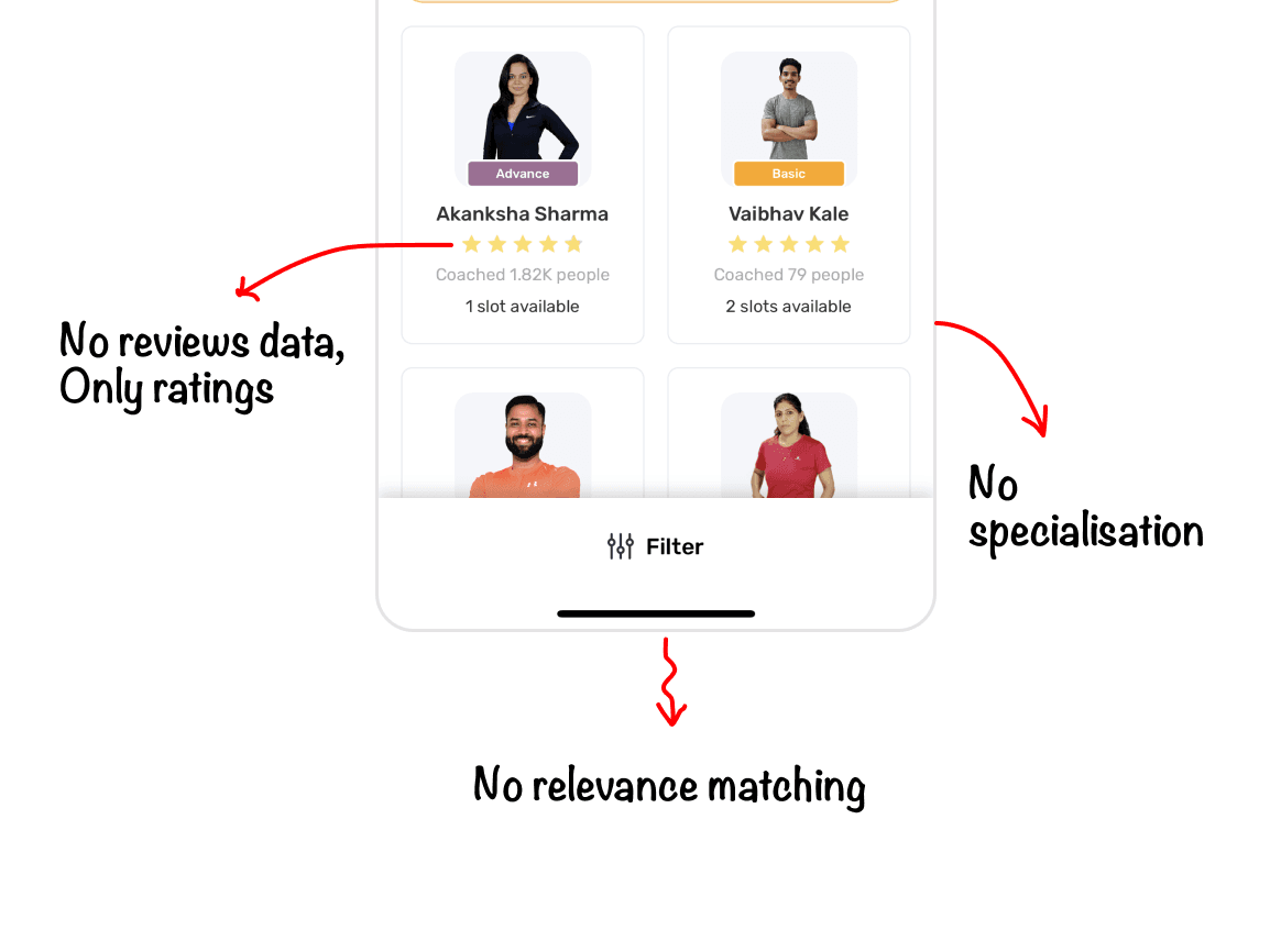
We never instrumented dwell time. The symptom came from support conversations and community posts, not from an event.
04 — The strategy
People choose a coach the way they choose a doctor.
The right comparison was Practo, not an e-commerce checkout. People want credentials, a specialisation, some sense of how many others this person has treated, ratings, and reviews they can interrogate. Almost every decision in this project comes out of that one call.Revenue is traffic × conversion. The brief named one of them.
They weren’t unconvinced. They were undecided. So give them what a decision needs.
We didn’t need more people. We needed readier ones. So find them where the intent already is, or raise it.
The constraint was distance to a decision, not persuasion. Three of the four acts that follow close that distance with information. The fourth closes it with intent.
The brief covered five stages. I mapped eleven.
Drawn before any screen was designed. Every card carries the job it does.Mapped anyway
Lead generation
Ad targeting
Signup
Onboarding
Home widget
Coaching intent
Where I worked
Get A Coach
Coach listing
Coach profile
Coach plans
Checkout
11stages mapped
5stages in the brief
~40cards, each tagged
The brief was the enrolment flow. I mapped from lead generation to payments, then built the part I owned.
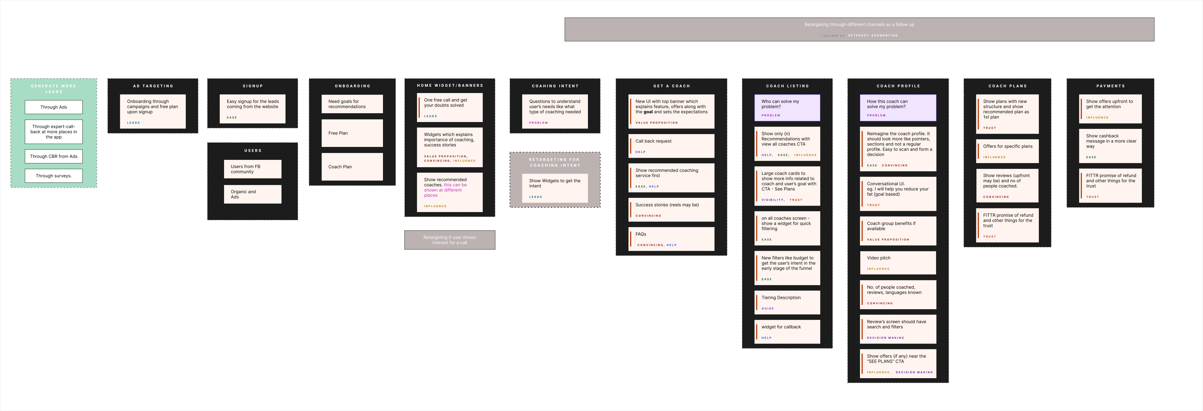
Every decision carries the job it does
The same thirteen terms annotate every decision from here on.Recently viewed coaches
“Why should I?”
“Do I understand this?”
“How much effort?”
Reaching out
Everything from Get A Coach through payments shipped, bar the cross-service widget and the video pitch. Coaching intent didn’t ship at all. All three needed an external team that didn’t exist, so I designed them ready for when it did.
What the work had to run inside
Falling revenueWhich ruled out building instrumentation before shipping anything.
No event instrumentationThe events needed to analyse dwell time were not in place.
Legacy checkoutLocked behind legacy code, so it could never be fully rebuilt.
Support bandwidthOur best-converting channel was the one we could not scale.
05 — Phase 1
Before rebuilding anything, we shipped five changes on the screens we already had.
Two to test the theory. Two because the evidence was already conclusive and revenue shouldn’t wait six months. And one that produced nothing at all. By the time we committed two months to the redesign, we were building against proven assumptions rather than placing a bet.| Phase | What it was | Duration |
|---|---|---|
Phase 1 | Small tweaks and experiments inside the existing UI guidelines, shipped live | ~4 months |
Phase 2 | The full flow designed for the remaining screens | 2 months |
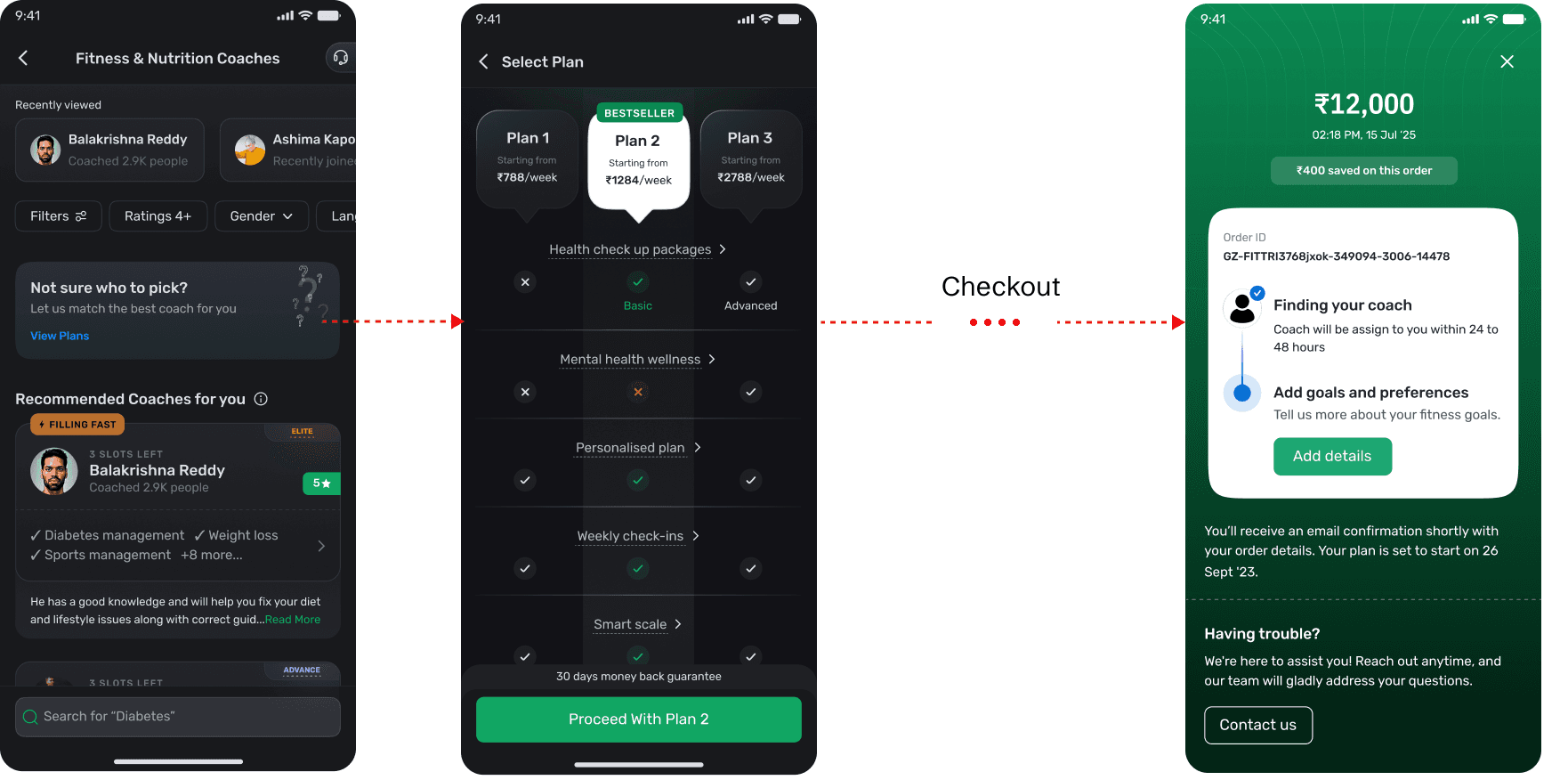
EMI and UPI, on the old checkout
Support had identified the blocker, so it went live months before the redesign that would otherwise have carried it. The sticky footer says “3/6 EMI options available” and “pay via card, UPI, net banking”.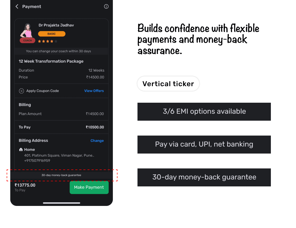
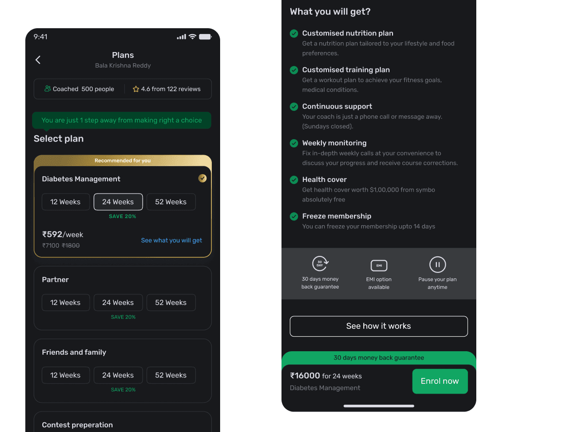
The coach plans screen
Revamped early and shipped inside the existing UI guidelines. Drop-off fell, though we only have the direction, not the size.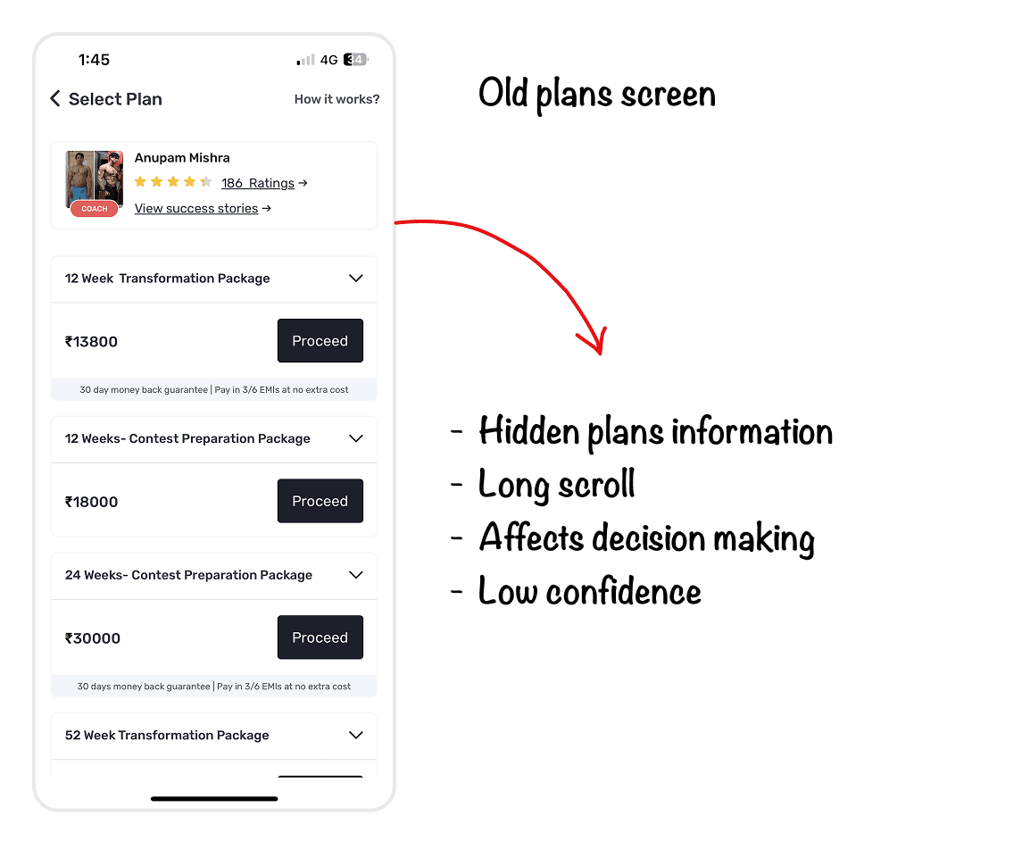
Recently viewed coaches
Most people go on to enrol with a coach whose profile they had already opened. That proved the “funnel has no memory” idea before we designed anything around it.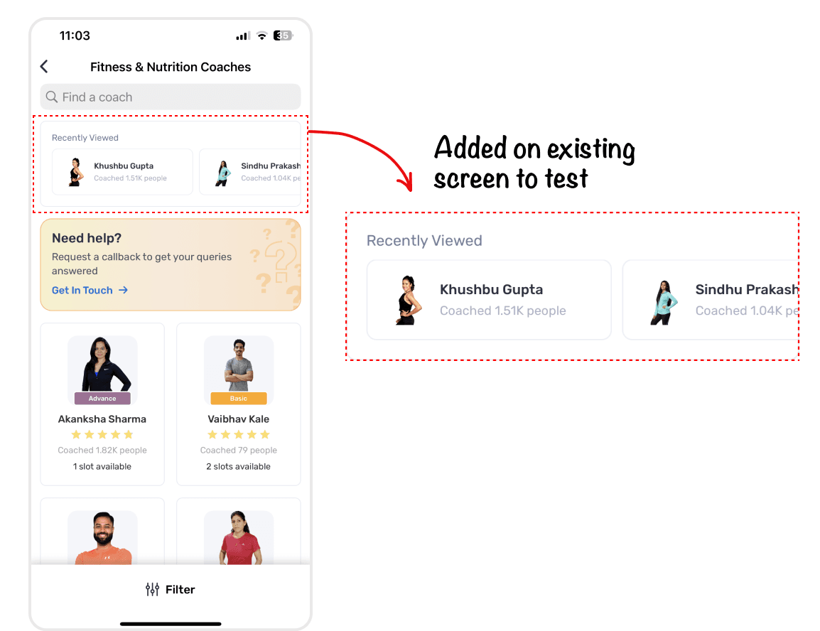
Talk to an expert
An A/B on a subset of users established that people who talk to the support team convert better. That test predates this project. I inherited the finding and built on it. Nobody kept the numbers.Health conditions, captured at onboarding
No user-visible benefit at all. Four of these changes bought something immediately. This one bought something months away. Part of a falling-revenue phase went on groundwork so those users could be reached later. The data did get used for targeting, but after this project ended.Act 1 — Decidable
A coach card had to answer one question: is this person right for me?
Every field on the card traces back to the Practo hypothesis about what this decision needs. It isn’t a card that looks better. It’s a card specified from a claim about behaviour.Specialisation, people coached, tier, rating, skill tags, slots left and a filling-fast marker. Each one answers a question people were already asking.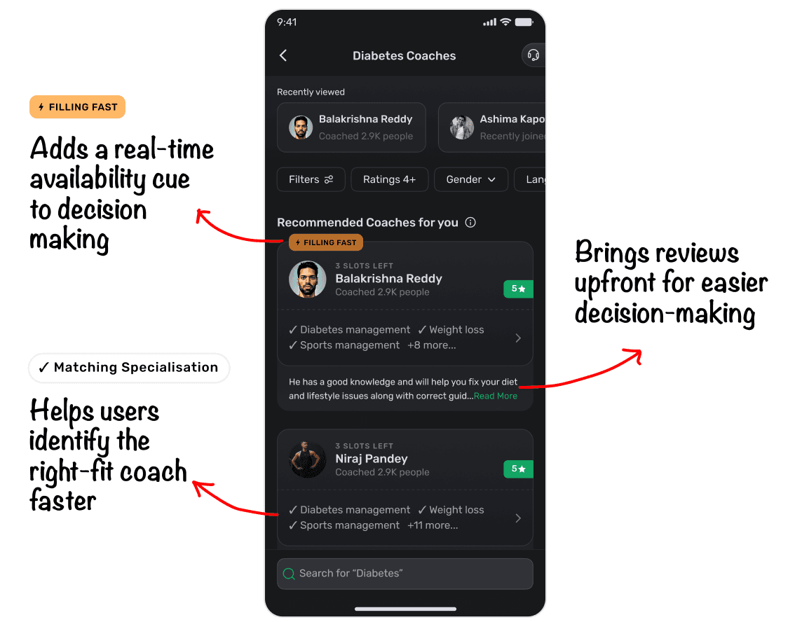
The card is a system of states
Any card looks good with five reviews and three skill tags. The judgement shows in what a new coach with no history looks like. So that state leads, sitting next to the fully-populated one.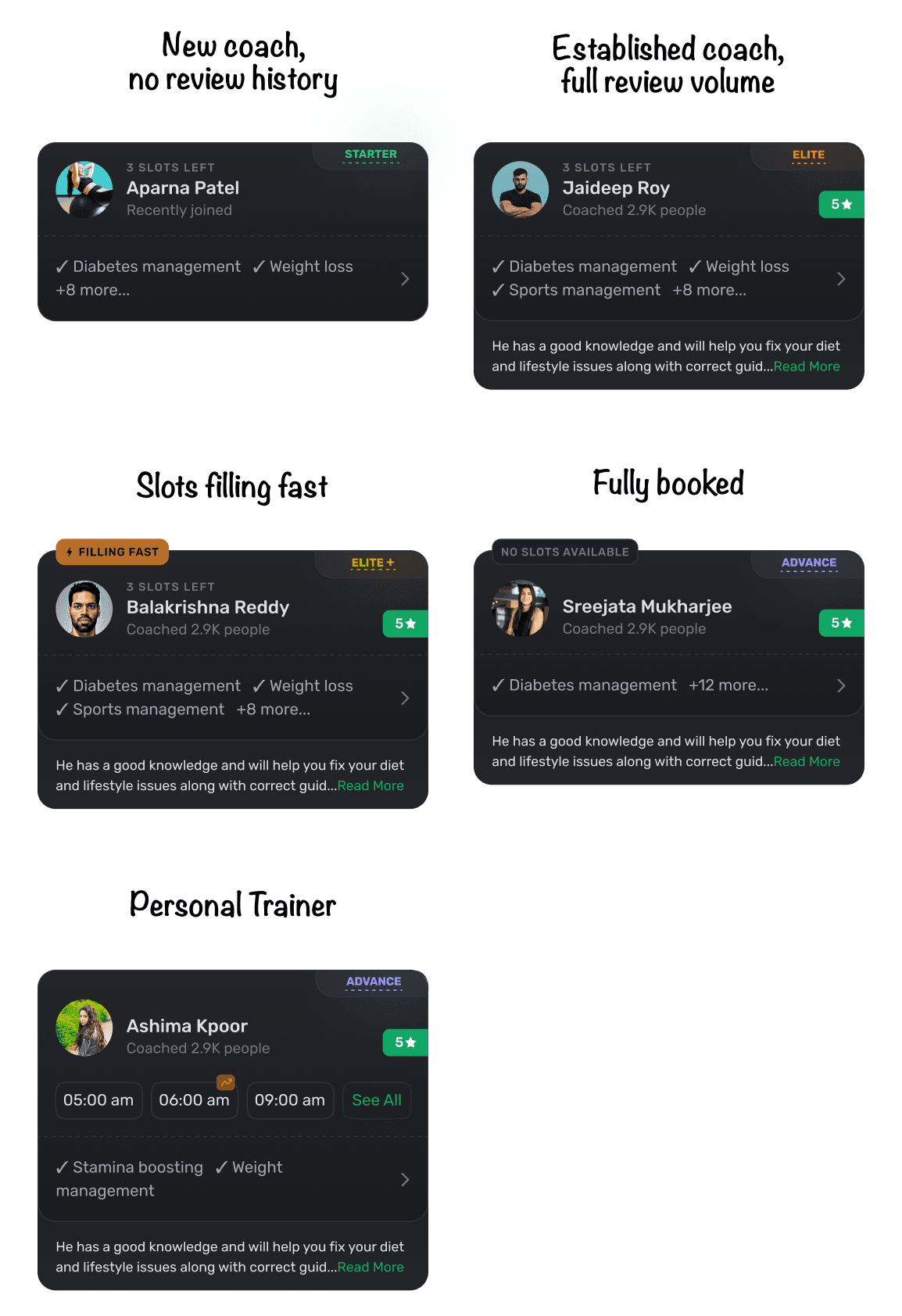
A summary written from the coach’s own reviews
Generated from the coach’s reviews and bio. The model isn’t the part worth claiming. The decisions were that a written summary belonged on the card at all, and what it should be built from.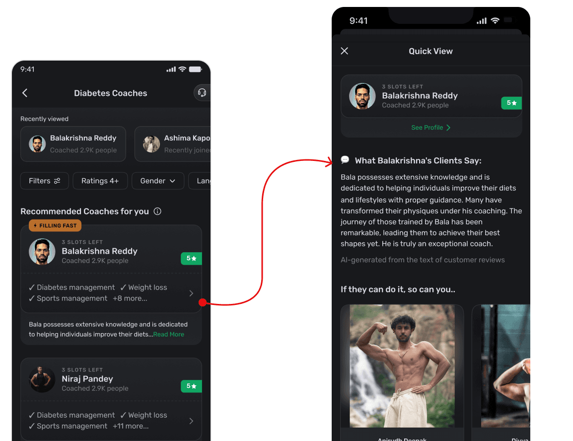
Explaining the tiers
Nobody knew what standard, advance and premium meant, or why they should care. It was a vocabulary problem, so we solved it with motion rather than a help article.Reviews you can interrogate
Searchable by keyword: weight loss, diabetes, guidance, accountability. You read the reviews that match your own situation instead of whichever ones happen to be newest.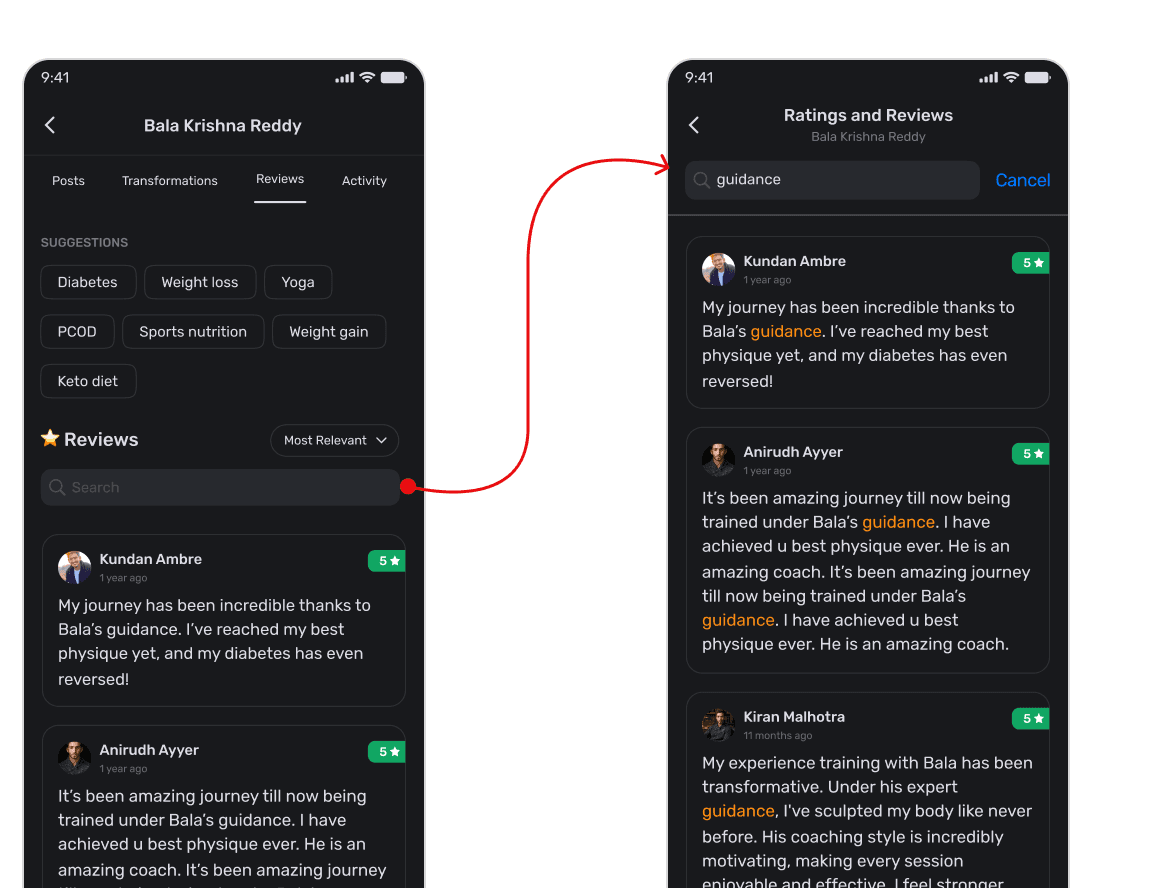
One colour, carried across every surface
The category you pick follows you from the tab into your plan card, your orders and your package history. It changed how people talked about the product. They started saying “the Yoga page with the red tab”. Text labels sit alongside the colour everywhere, so the meaning survives without it.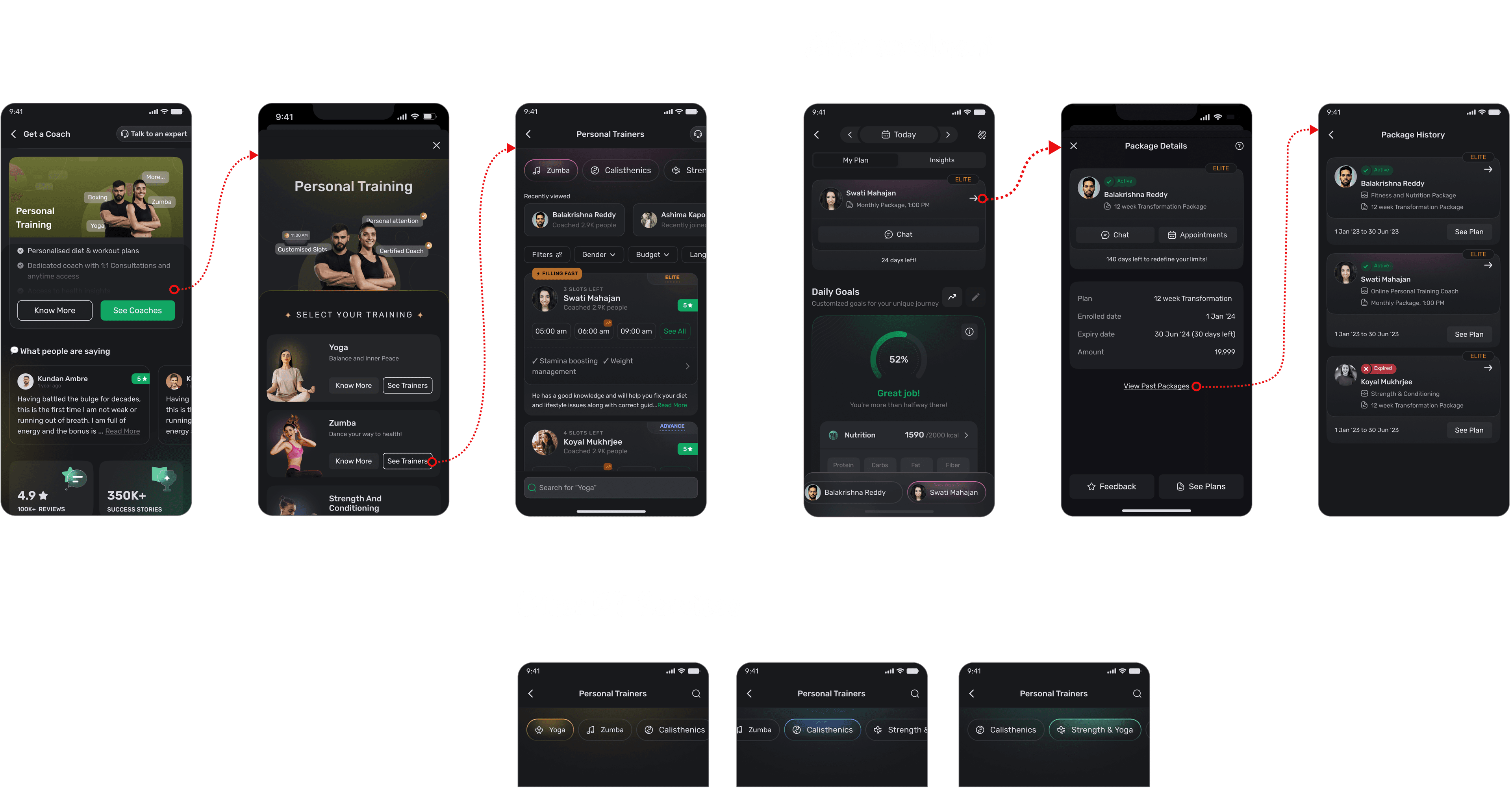
Act 2 — Resumable
The funnel forgot everything you’d already decided.
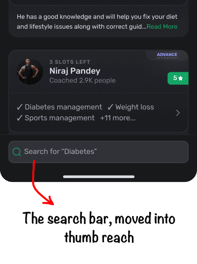
A searched name, a viewed coach, an abandoned checkout. All of it thrown away. Four features, one idea between them.The bottom search bar
People search for coaches by name, having heard it from a referral or the community. The search bar was out of thumb reach.
iOS had moved to bottom-anchored search and Zomato had followed. Expectations were shifting with the platform.
Moved it to the bottom, against PM opposition, and offered an A/B to settle the disagreement. The team shipped without one. Searches rose 5%.
A pattern change for existing users, and a disagreement to absorb before anything could ship.
Recently viewed
People often compare multiple coaches before deciding. So we surfaced recently viewed profiles on search and listing pages, making it easier to return without searching again.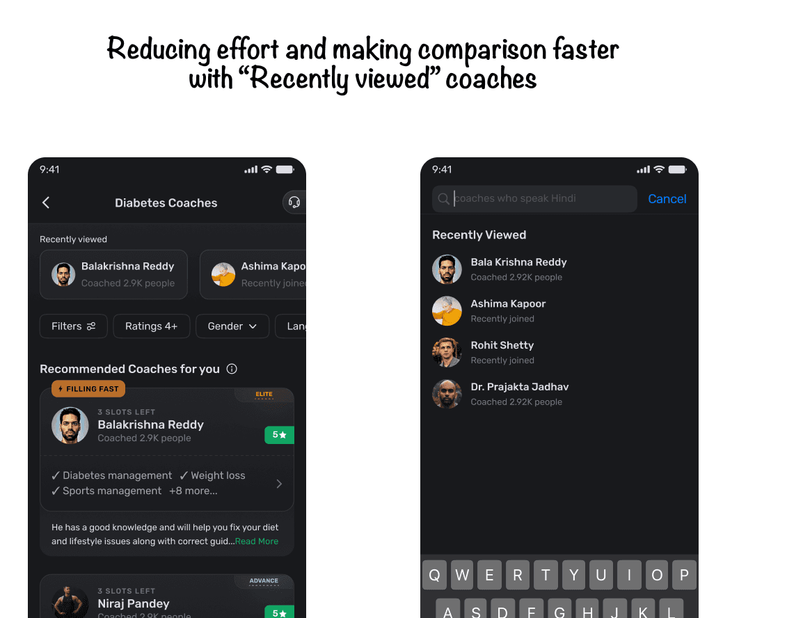
A way back into checkout
It fires when someone drops out of checkout. One tap to pick up where they left off instead of starting again.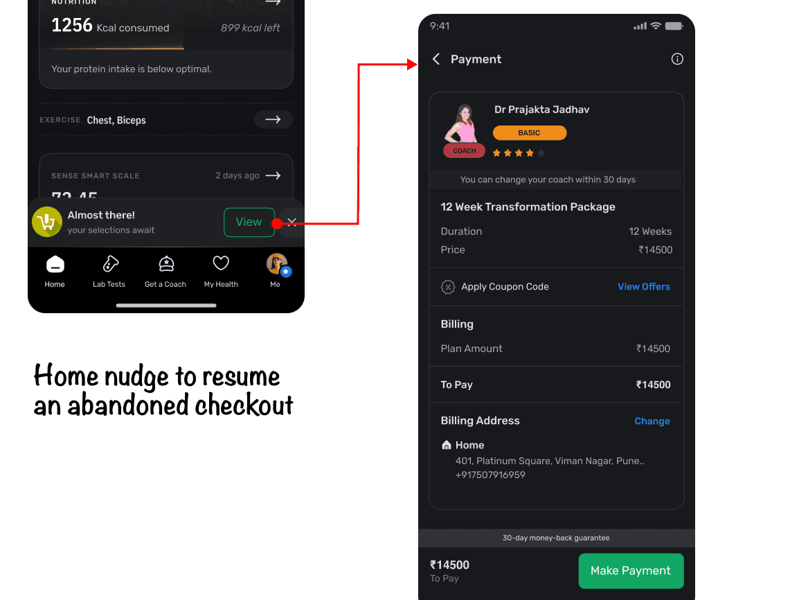
−35%
Time to conversion, from recently searched and recently viewed. This sits inside the signup-to-conversion reduction below rather than adding to it. We never measured conversion rate, so what I can claim is that people converted sooner, not that more of them converted.
Act 3 — Friction
We never got the checkout page. We got the footer.
The checkout was locked behind legacy code and never got rebuilt, so the work moved to what we could edit: the sticky footer and the add-ons slot. It still looks old. It is shown here as it was.Two changes came out of that. An exit-intent survey asking what made you cancel is the project’s only piece of pure instrumentation.The other was add-ons. Worth naming the tension: the whole thesis of this project is that hesitation was killing the funnel, and add-ons put a new decision in front of someone at checkout.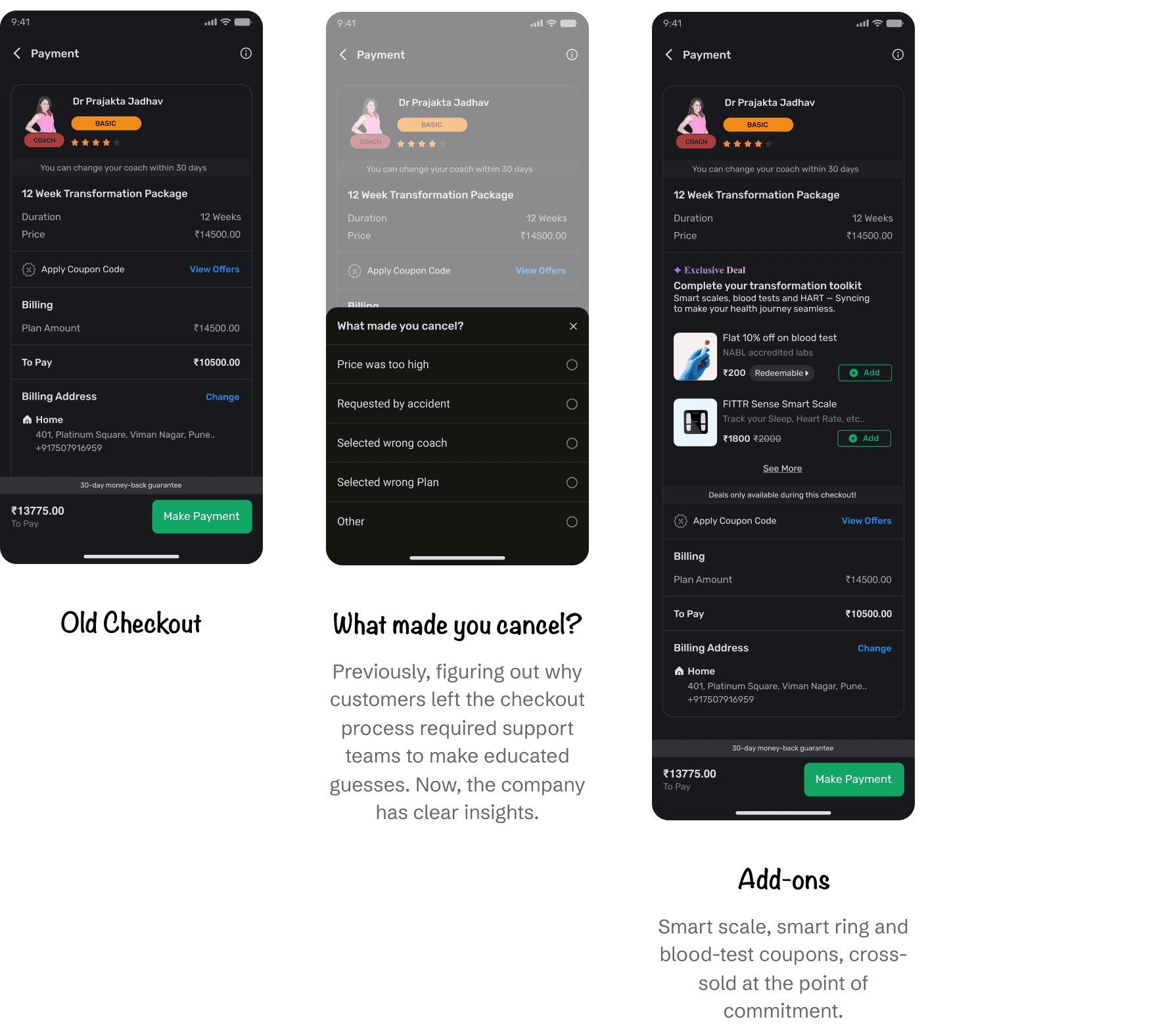
Act 4 — More ready people, not more people
The funnel didn’t need more people. It needed readier ones.
Ads and surveys to find intent. Call-backs to capture it. And where intent was only moderate, an expert conversation to raise it. That last one came straight out of the Phase 1 A/B, which found that people who talk to support convert better. An experiment finding turned into an acquisition strategy.Entry points matched to intent
Then a reversal-journey route for pre-diabetic users. Someone starting a reversal journey has an acute, named health reason to want a coach. The decision is already live, and the entry point just arrives where it is. That is a different act from buying traffic.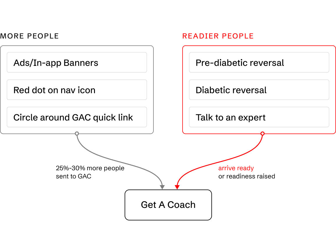
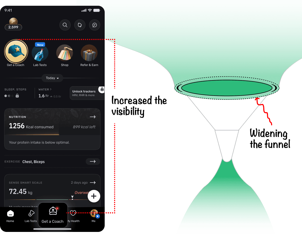
A dot beside the coaching icon
+25%
It increased the entries to Get A Coach
It raised visibility. It did not raise intent, which is why the intent work mattered.These were current app users joining the coaching funnel, not newcomers to FITTR. It was about widening, not acquiring. The dot indicated something truly new, and it disappeared once accessed. The golden circle around the GAC quick link vanished after enrollment began.The revamp shipped alongside it, so the dot can’t be isolated. Entries rose after both landed. More people at the top only helps if some of them are close to deciding, which is the whole reason the work above exists.
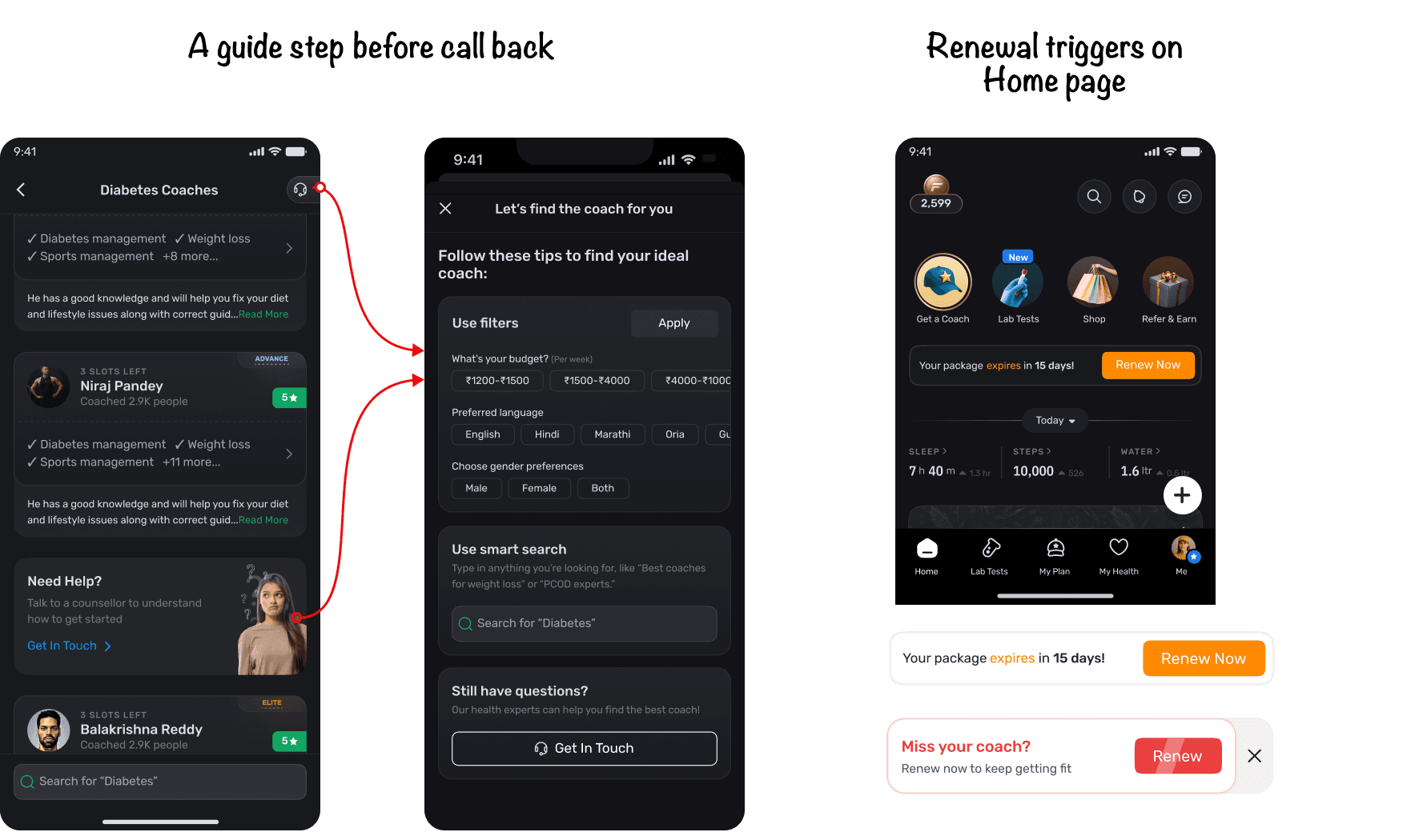
A guide step in front of the call-back request
People genuinely needed help at the point where browsing had turned into fatigue.
Our best-converting channel was the one we couldn't scale. Call-back beat self-serve, so it had to survive. But support had no bandwidth to take more volume.
A self-serve filter-and-search step in front of the call-back request, after the tenth coach card. Help most people without a human, and route the rest.
An extra step in front of people who wanted a person. I knowingly added friction to a converting path to protect another team's ceiling.
Talk-to-expert widgets at several points in the funnel, placed on the back of the Phase 1 finding.
Renewal triggers on home and My Plan.
Auto-assign
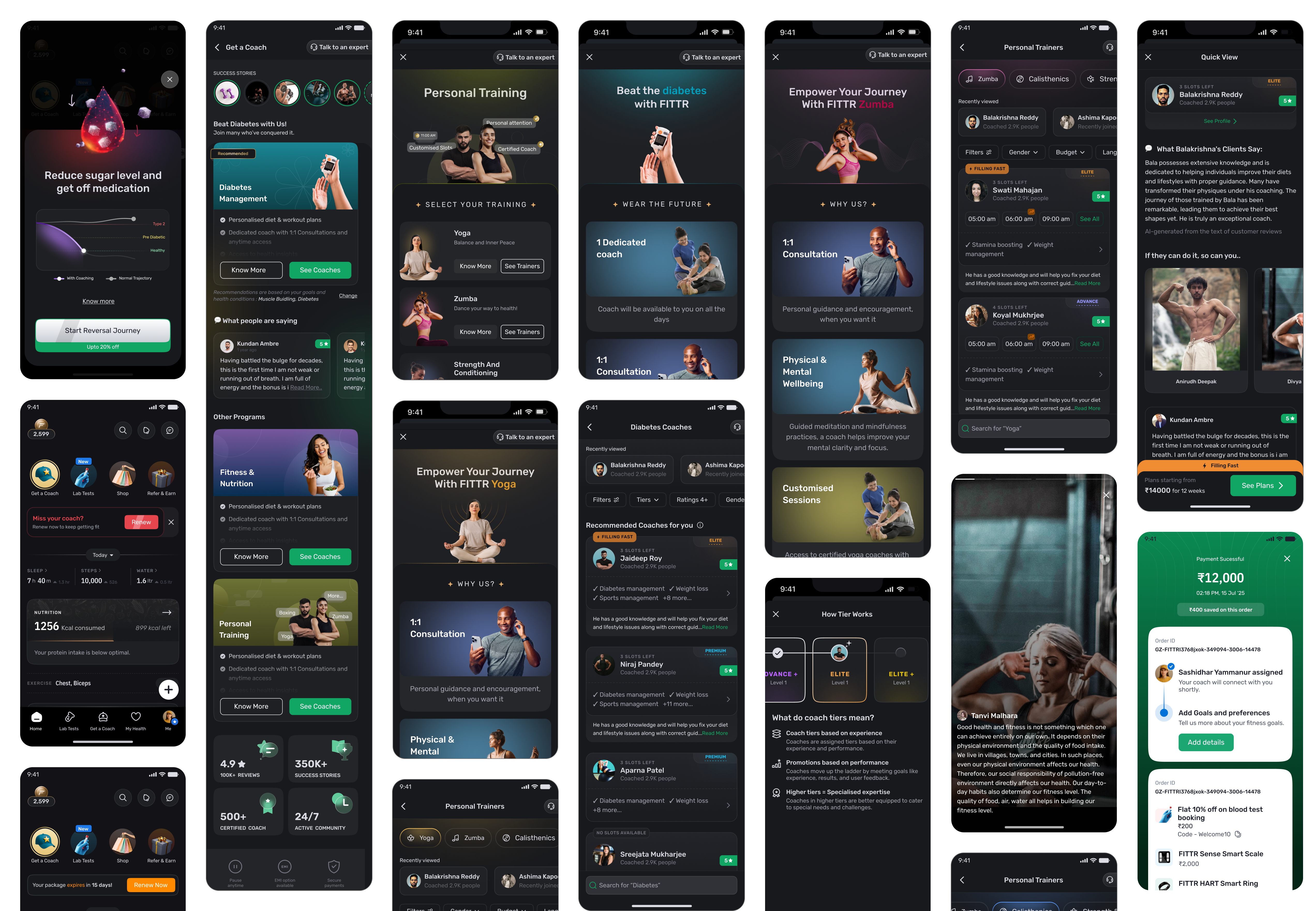
Key screens
The outcome
21 days to 11.
1.9x
Faster to enrol.Readier people coming in, and fewer reasons to stall once inside. Average signup-to-enrolment fell from 21 days to 11.+6%
Revenue.Revenue growth after the funnel changes launched.+30%
Entries to Get A Coach.Existing users entering the funnel. It raised visibility, not intent, which is why the intent work mattered.There was no A/B test and no control group on the Phase 2 changes. These are movements observed after launch, not effects isolated to individual features.Some of the cycle-time improvement is composition. We deliberately brought in people who were closer to deciding. That was the point, not a confound.Some of that exposure likely compounds: people who learned how tiers and coaching work return readier. We measured that effect at the coach level, through recently viewed. We never instrumented it at the system level.Two things we observed rather than measured. People who viewed highlights stayed longer on Get A Coach, and the trust factors, stories and reviews lifted top-of-funnel clicks.
What I’d measure differently
- 1.Dwell time on the coach listing screen. It was the stated symptom and we never instrumented it. The events didn't exist, revenue was falling, and shipping came first.
- 2.Cohort conversion for first-time Get A Coach visitors. That read would have settled whether the red dot's exposure compounded. Naming the measurement is worth more than asserting the conclusion.
- 3.Conversion rate for recently viewed, not just time to conversion.
- 4.Support contacts per visitor, which would have proved the need-help argument.
- 5.Checkout recovery rate, for the resume nudge.
Reflection
What I’d do differently.
1
Ship what the evidence already supports; design what it doesn't.
EMI and UPI didn't wait six months for a redesign. They went live on the old checkout the moment support's data made the case. Revenue doesn't wait for a design system.2
Validate cheaply on the product you already have.
Phase 1 tested the diagnosis inside the existing UI, so the two-month investment was made against proven assumptions rather than a hunch.3
You can't always have the page.
Checkout was locked behind legacy code, so the work moved to what we could edit. Constraints relocate the design. They don't cancel it.Not every funnel problem is a friction problem.The instinct with drop-off is to remove steps. These people needed more information, not fewer screens. They were deciding, not queuing.
The funnel leak occurred because we failed to compare dashboard metrics with support team data. This emphasizes the need for a unified approach to data analysis, integrating all information to enhance our decision-making.