EcosystemVisual DesignInteraction Design
Discover how I boosted user retention by 22% for a diet tool and effortlessly integrated it into FITTR ecosystem.
FITTR’s diet tool had low adoption. The research said users hadn’t stopped logging, they’d stopped logging here. Fixing that meant rebuilding both halves of a two-sided product: the people following plans, and the ~700 coaches writing them.
Head of Design
2 designers + 1 PM
2 months
Figma, Chatgpt
01 — The challengeThe brief was a solution, not a problem.
“Adoption is low. Revamp the diet tool.”
That was the entire ask. It named a symptom and prescribed a cure, and it arrived with no problem definition, no research and no scope boundary.The evidence base
Five inputs, chosen so they could disagree with each other.
I wanted stated need, unprompted complaint, observed behaviour and a market baseline — so that no single source could carry the conclusion on its own. The brief was about users, so I researched coaches too. They write every plan in the product.10+Store reviews, past 6 monthsRecurring problems in food discovery, logging, portion selection and nutrition tracking
5Coach interviewsCoaches reported their clients were logging in other apps — and asked for visibility when a plan is edited
4User interviewsUsers felt they were paying for a plan that never changed
5Session recordingsTwo behaviours that became two design changes — see the two bets below
2Competitor teardownsHealthifyMe and MyNetDiary: what they beat us on, and where they didn’t
What the competitors were doing better
| MyNetDiary | HealthifyMe | |
|---|---|---|
Food database | Better in industry | Decent |
Calendar | Today upfront, with yesterday and tomorrow arrows | Today with a dropdown for calendar |
Catalogue | Upfront tabs for adding items | No catalogue |
Model | Free and Paid | Limited options in Free version |
Quantity editing | Edit screen with a food score | Locked micronutrients; the dropdown on the quantity field makes first-time edits difficult |
Photo logging | Recently launched | Available |
It would be great if you can make per meal macro consumption in app
Please improve your list. I could not even find macro of a simple packaged food item which is of a known brand that is Nestle
Whenever I copy a diet chart for another date, it is acting weird and not saving properly.
The choice of food selection is low so probably ref data needs to be updated.
The retention gears of a diet tool are a reliable food database, easy movement between days, and easy adding and editing of food — plus recipes, because users are always asking what to make from the ingredients they’ve been given.Conclusion from the competitor teardown.
02 — What we learned
Users hadn’t stopped logging. They’d stopped logging here.
Coaches told us their clients were logging in third party apps. That changes the problem entirely. We weren’t persuading people to build a habit – they already had one. We were competing with the tool they’d already chosen, and losing.This came from coaches reporting on their clients, not from instrumentation. It’s the strongest signal we had, and it’s secondhand.Two layers, failing at once..
A two-tab consumption model users couldn’t read · the calendar buried in a menu · recipes that couldn’t be logged · a crowded main screen
Missing food items, wrong macro values.
A better interface on wrong data still gives you the wrong number. Correct data behind a confusing screen still costs more than the competitor.
And there was a third problem underneath both:
Enrolled users thought coaches didn’t put enough efforts on their plan.“I’m paying for this, and I get the same chart every day.”
03 — The approach
Three bets, and one nobody asked for.
I couldn’t fix the food database. It holds around a million items and another team was correcting them in batches as bandwidth allowed — a multi-quarter data problem sitting inside a two-month design cycle.So the strategy had to make the tool worth using while the data underneath it was still wrong. That meant reducing how often a user’s success depended on one correct catalogue entry.| Root cause | Bet | What had to be true |
|---|---|---|
| Logging costs more here than elsewhere | Make logging cost less than leaving | A user can log without starting from a catalogue search |
| The plan gives no reason to return | Make the plan legible before the day arrives | Each day is worth opening, and tomorrow is reachable tonight |
| Coach time is the capacity ceiling | Give coaches leverage | Coaches see what happened, and the plan uses data we already hold |
| The team can’t hear from users | Build the loop via feedback component | Feedback reaches a named owner on a cadence |
With challenges..
No A/B testEngineering bandwidth, and the legacy code had to be replaced regardless
An AI cost ceilingWhich cut one feature entirely
Two monthsFor a two-sided rewrite across both platforms
A ~1M-item catalogueOwned by another team, fixed in batches
The problem we couldn’t solve
Users kept asking the same question of their own plan: oil 10g, uncooked rice 50g, any dal 40g — what do I make out of this?I proposed generating recipes from the exact ingredients a coach had assigned, so the plan arrived as something cookable. Three routes, three reasons it closed.| Route | Why it closed |
|---|---|
Generate recipes with AI | AI credit and token cost. The economics didn’t support it |
Reuse the recipes we already had | They weren’t reliably authored and could carry wrong macro values. A nutrition feature built on unverified numbers is a complaint risk |
Buy recipe data | Not available to us at the time |
We parked it toward community-led, compliance-checked recipes in a later phase. Two of the three routes died on data quality we didn’t own — the same bottleneck as the food catalogue.
04 — Key decisions
3 bets, and the parts of each that shipped.
Decision 01
We weren’t competing with our old tool. We were competing with a competitor.
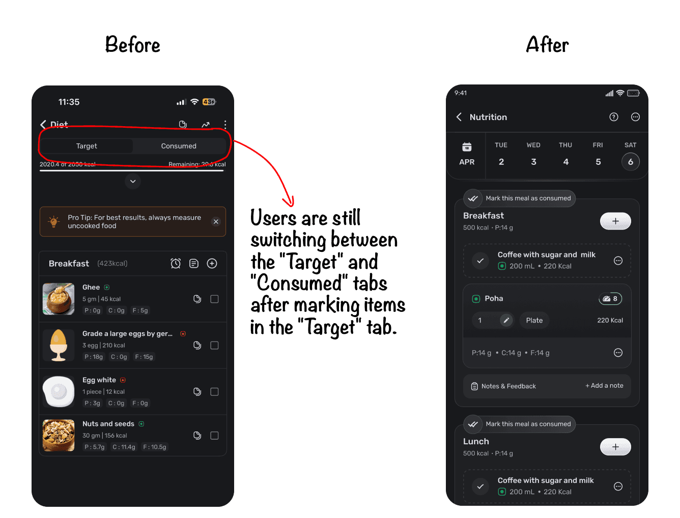
Every gram of effort removed had to beat the app users had already switched to.Enrolled users have an assigned list (checklist). Non-enrolled users have no list (search-and-log). Two jobs, two models.Three paths shortened search-and-log:
Post launch, 46.24% of users logged via chat.- 1.Chat logging
- 2.Recipes from search/favourites
- 3.A catalogue showing recent + most-added foods before search.
One action, not two tabs
Log meals from photos
Users asked to log meals from photos. The model reads the image, suggests items, and the user confirms before logging.
Decision 02
Every day looked the same. So no one came back.
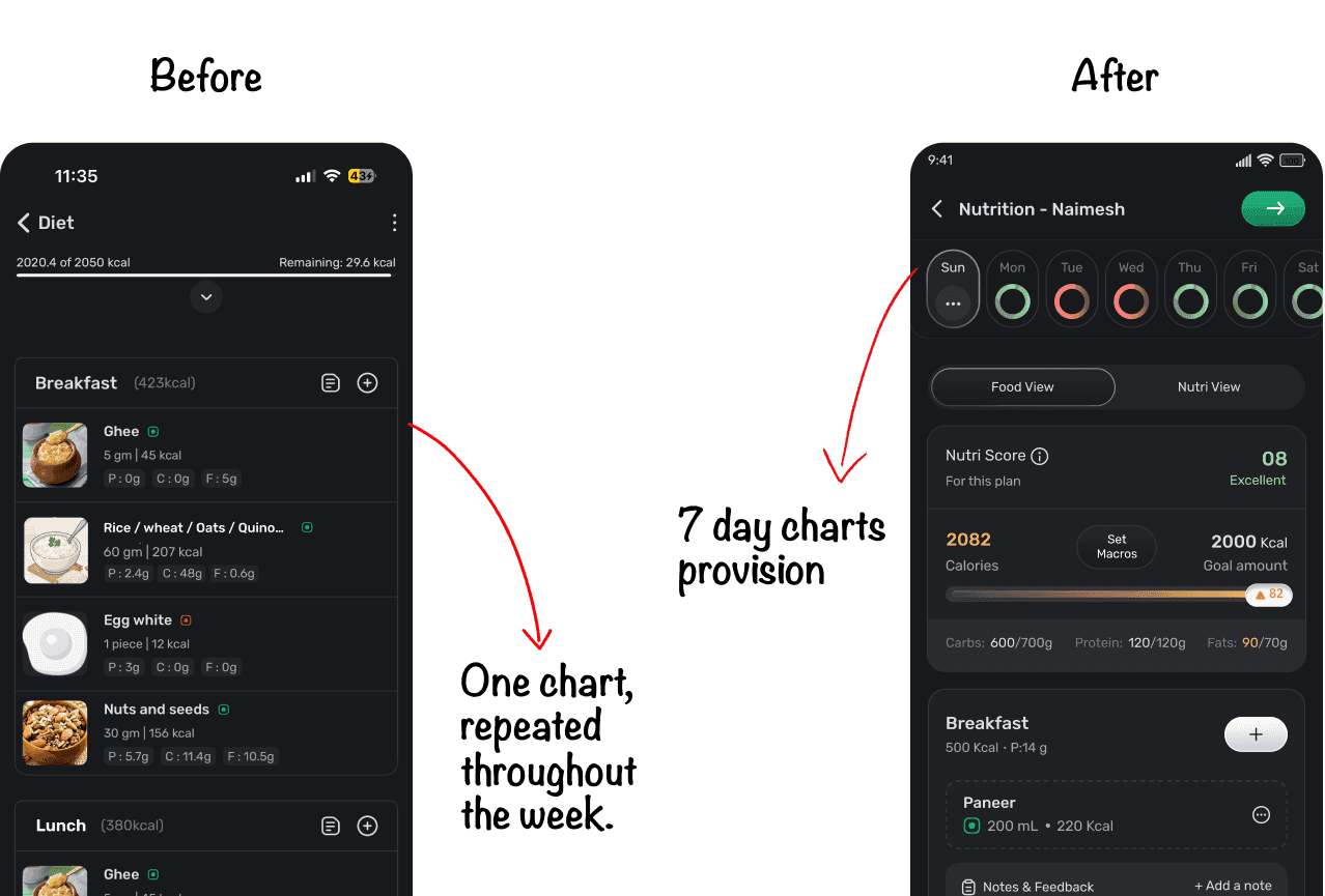
Coaches were assigning near-identical charts across the week, with several foods collapsed into one line — wheat / rice / bajari / jawar - 50g. Users read that repetition as coaches not putting effort into their plan.They weren’t bored. They felt short-changed. The plan is the visible part of what they’re paying for, and it looked like nobody had made it.Coaches were asked to vary the charts. When repeated communication doesn’t change behaviour, the system is usually rewarding the behaviour. So we changed the system rather than the message.
One chart, repeated → seven distinct days
What it gave users, it charged coaches
A differentiated week is more plan to write. Coaches already building a different chart each day gained from this. Coaches who had been writing one chart and applying it across the week now had seven.I took the change to leadership and the coach managers before designing it. I still under-estimated the size of the bill and the feature (Smart chart using AI) meant to absorb it had already been parked.
A week worth opening. Tomorrow reachable tonight.
Seven charts to write where one had been copied across the week.
The one that didn’t ship - Smart Chart
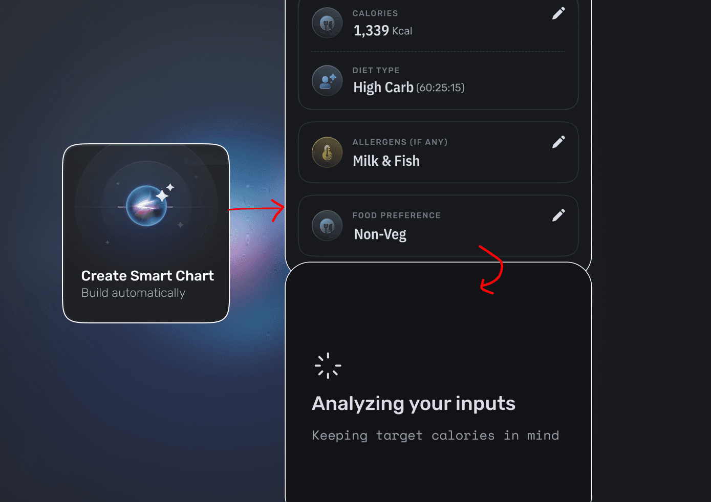
A third path for chart creation: generate from calories, diet type — high carb, Zone, keto — allergens and food preference, alongside building from scratch and loading a template. Not a replacement; an accelerator, with the coach still in control.It was parked before launch because of engineering bandwidth. It was also the feature meant to absorb the workload the seven-day chart had just created.
Decision 03
The brief was about users. The constraint was coaches.
Around 700 coaches write every plan in the product. Their time is the platform’s capacity ceiling, and they were working without two things: any signal that a client had gone off-plan, and any of the health data the company already held about that client.Eco system connection
Blood reports and profile allergies sat elsewhere in the platform and never reached the moment a coach was writing a diet. I surfaced deficiencies and allergies inside the diet tool, so the plan could account for them.Nobody asked for this. I took it to the leadership and the tech team; once the leadership was aligned, the team was too.
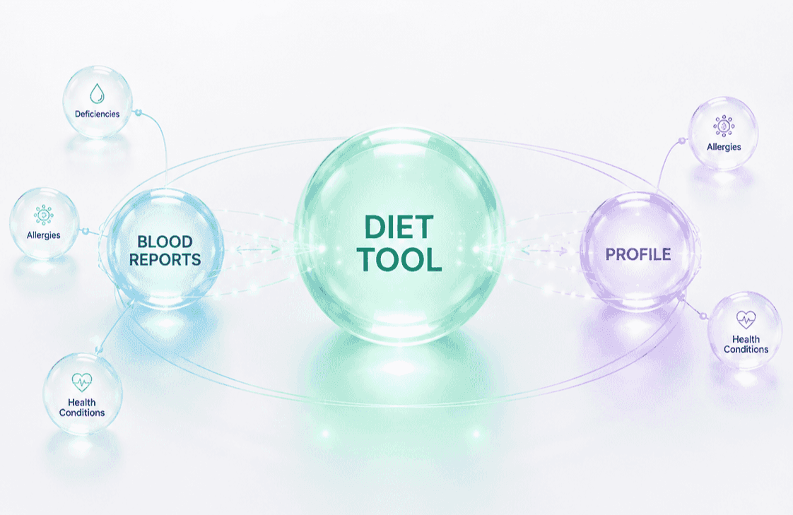
Changes made in the product
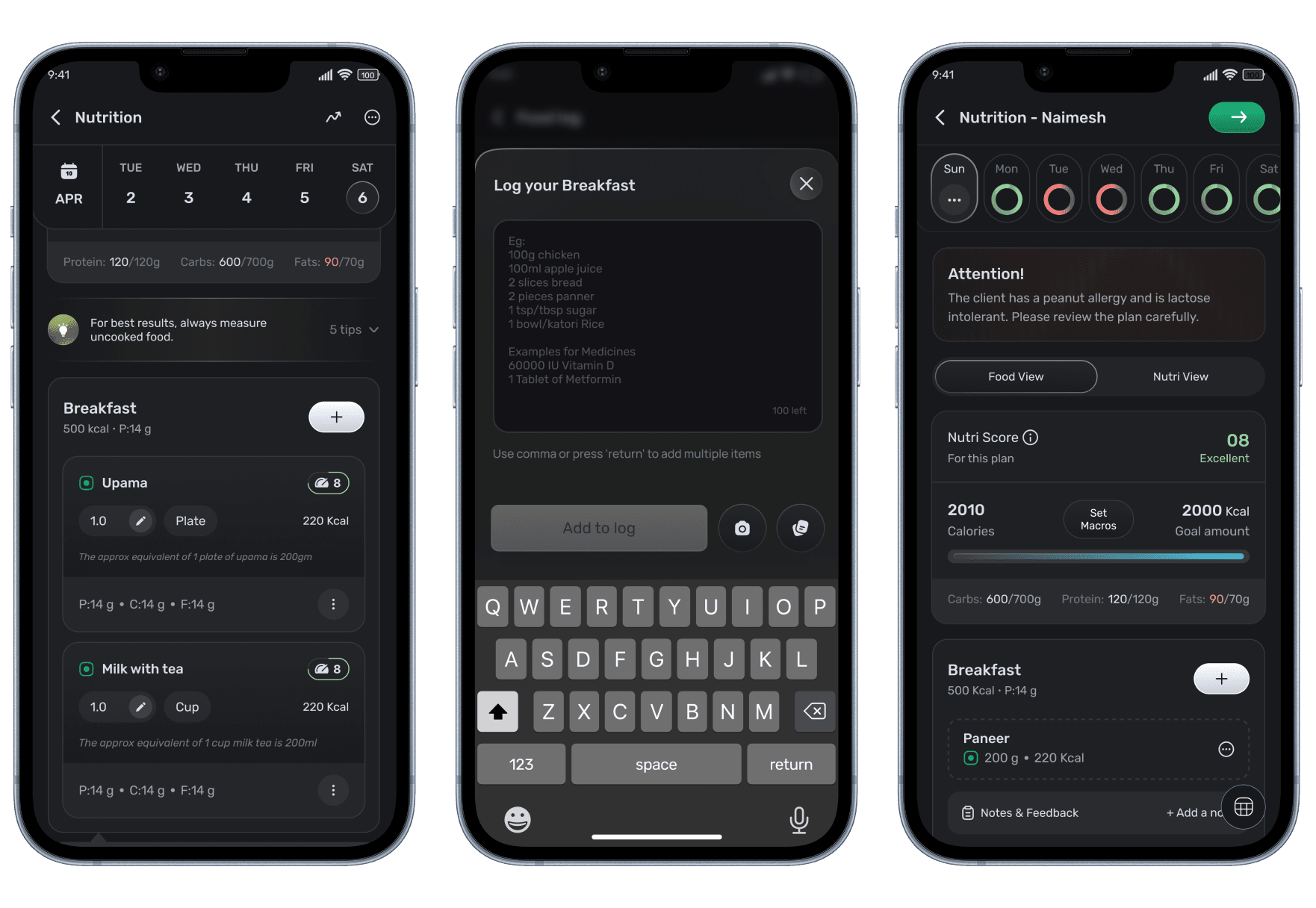
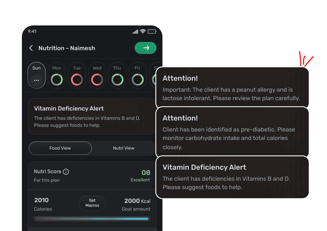
A coach writing a plan now sees the client’s deficiencies and allergies in the same place they’re choosing food. With this, coach can now build diet plan with complete context.
Deficiency surfaced from the blood report.
Allergy from the client profile.
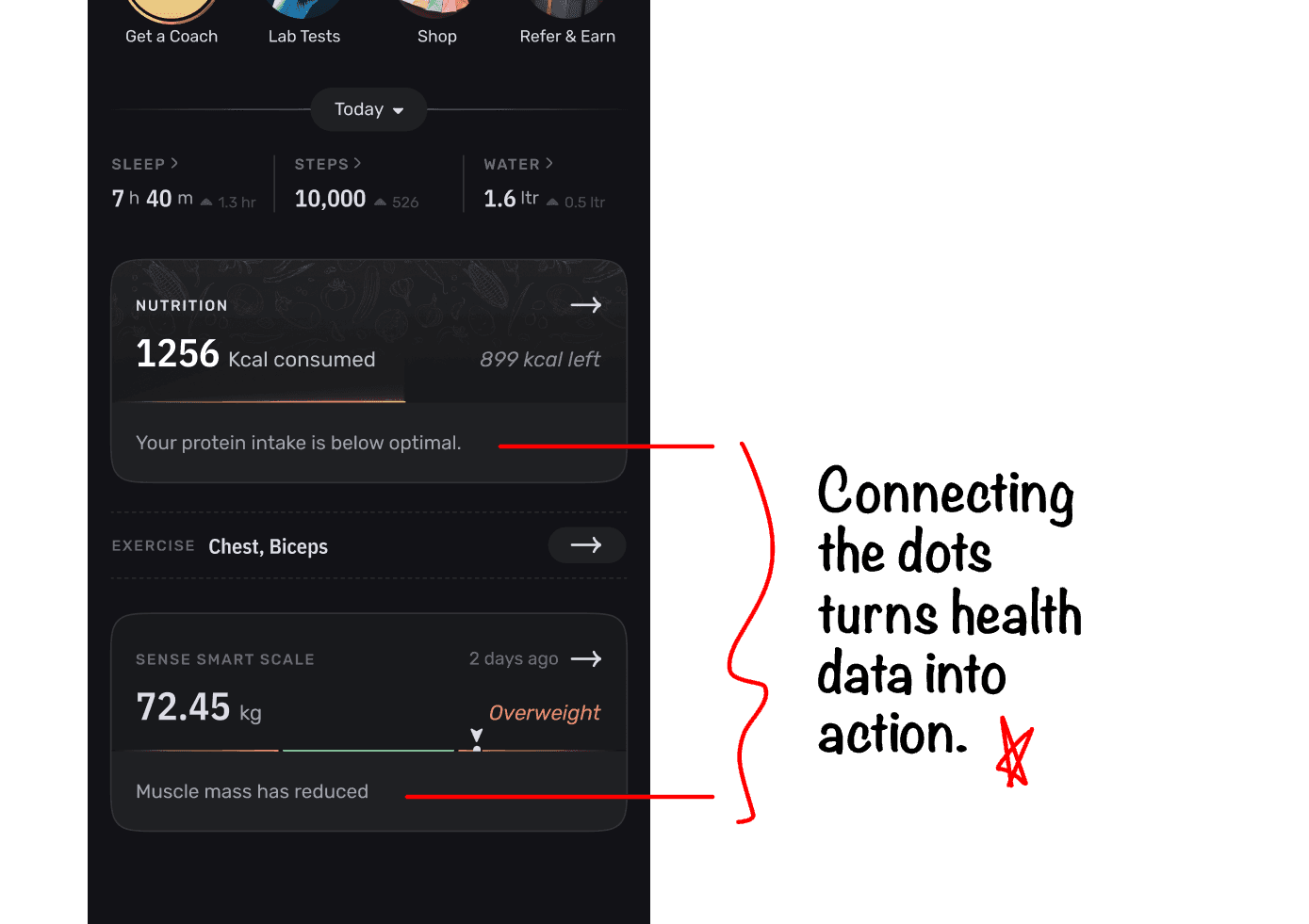
The same insight also travels outward. Nudges on the home screen’s meal card and the smart scale card — your protein is below optimal; muscle mass has reduced — let someone act without opening the diet tool at all.
05 — Building the loop
The team had no way to hear from users. So I designed one.
We weren’t collecting feature-level feedback at all. Product decisions were being made without a channel from the people using the thing.I designed an engaging feedback prompt that appears after someone has used the tool. Responses land in a product bucket, auto-assign to the PM, and are prioritized based on urgency. The tutorials and the feedback component were both built to be reused on other pages.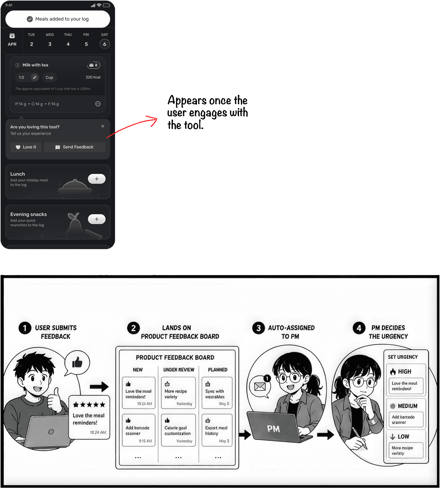
06/A — The shipped experience
Customer experience
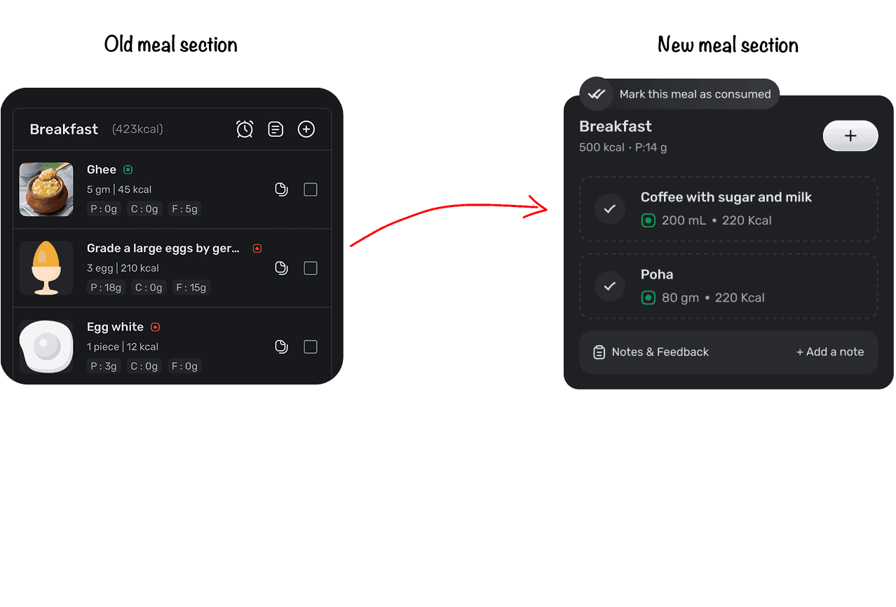
Simplified logging: no more logging first and then mark after consumption.
In the old flow, free users had to follow a two-step process to log their food consumption: first search through the catalogue and add to the meal, then manually mark the item as consumed. Now, with the enhanced chat-based logging system combined with the catalogue, users can easily log their meals, and items are automatically marked as consumed. It’s that simple!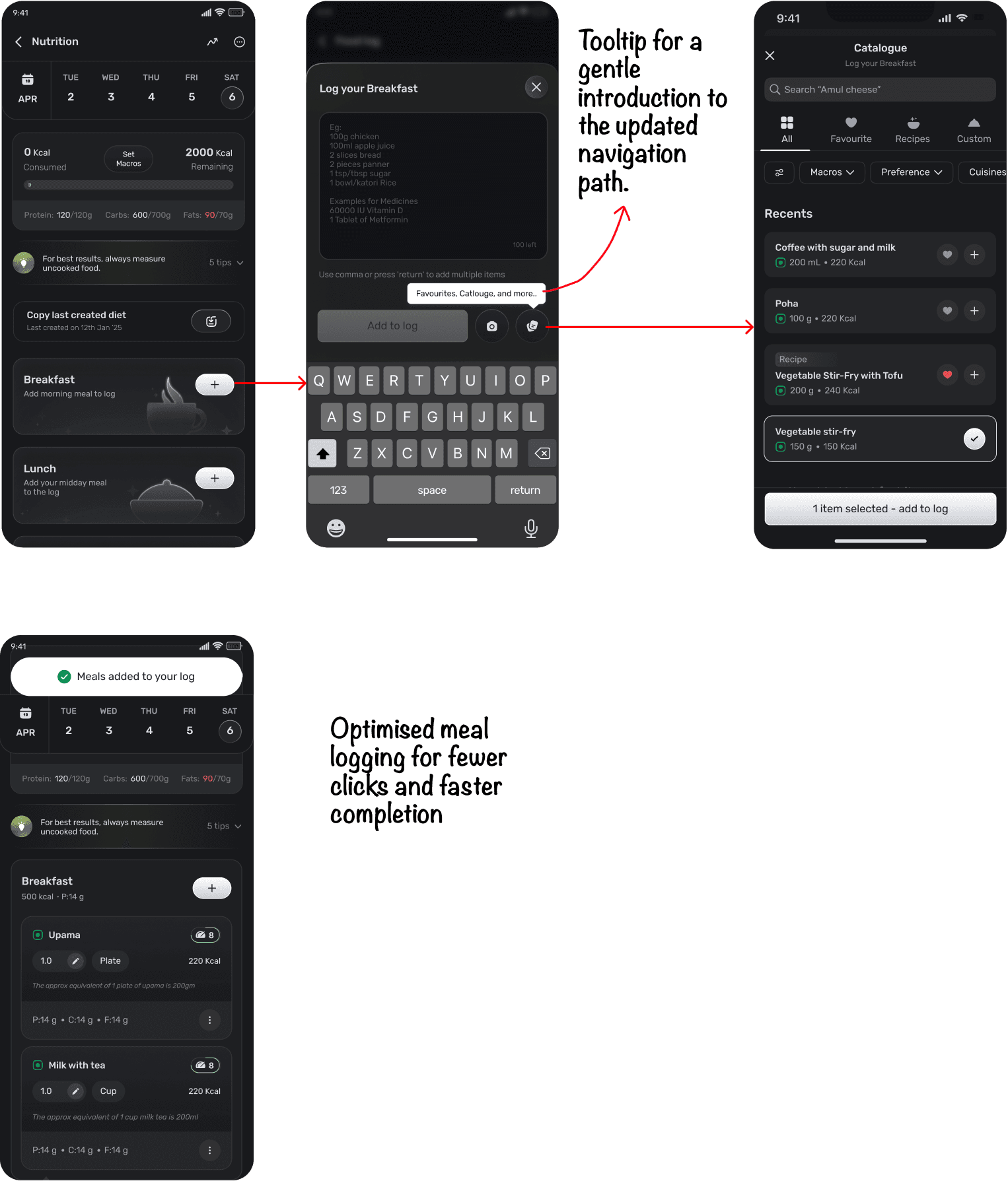
Better food decisions: easier discovery with nutrition context built in.
Our main goal was clear: to empower users to effortlessly explore food options, simplify modifications, and ensure everyday essentials are just a click away. We also integrated the Nutri Score to educate users on what scores well, promoting mindfulness in their eating choices.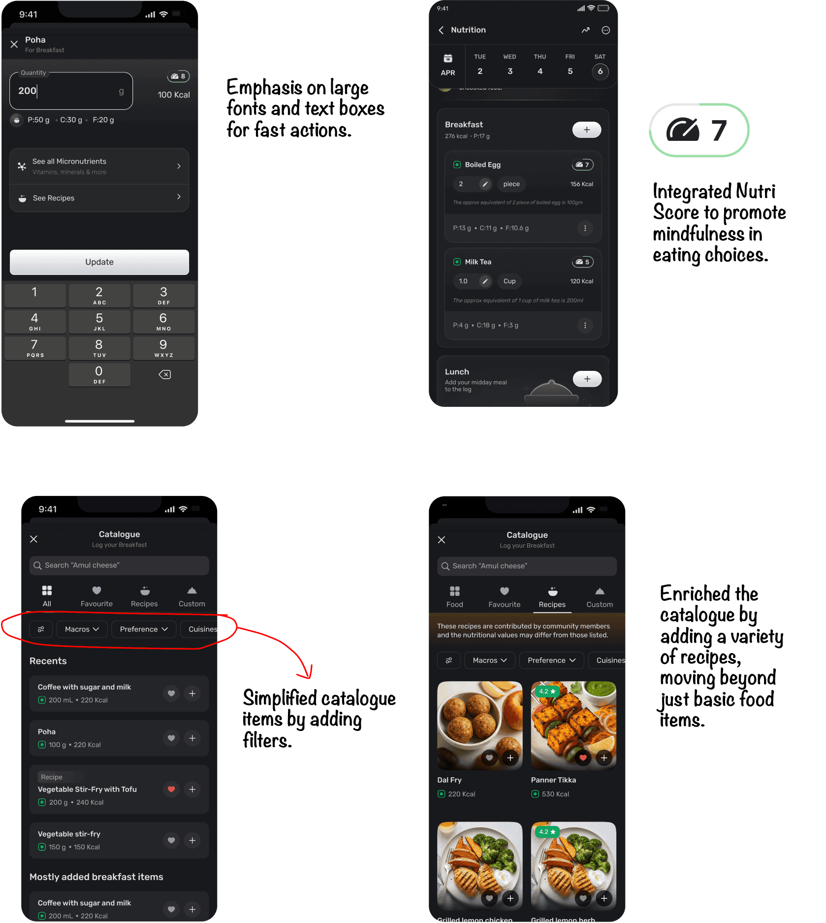
Enhanced experience for Enrolled users
Only important data shown upfront - Food item name, quantity, and calories. Added big checkboxes for faster marking. Big solid plus button for easy logging.The whole plan at once. A table view of the assigned chart, so a user can see the full week rather than reading it a day at a time — useful for anyone shopping or prepping ahead.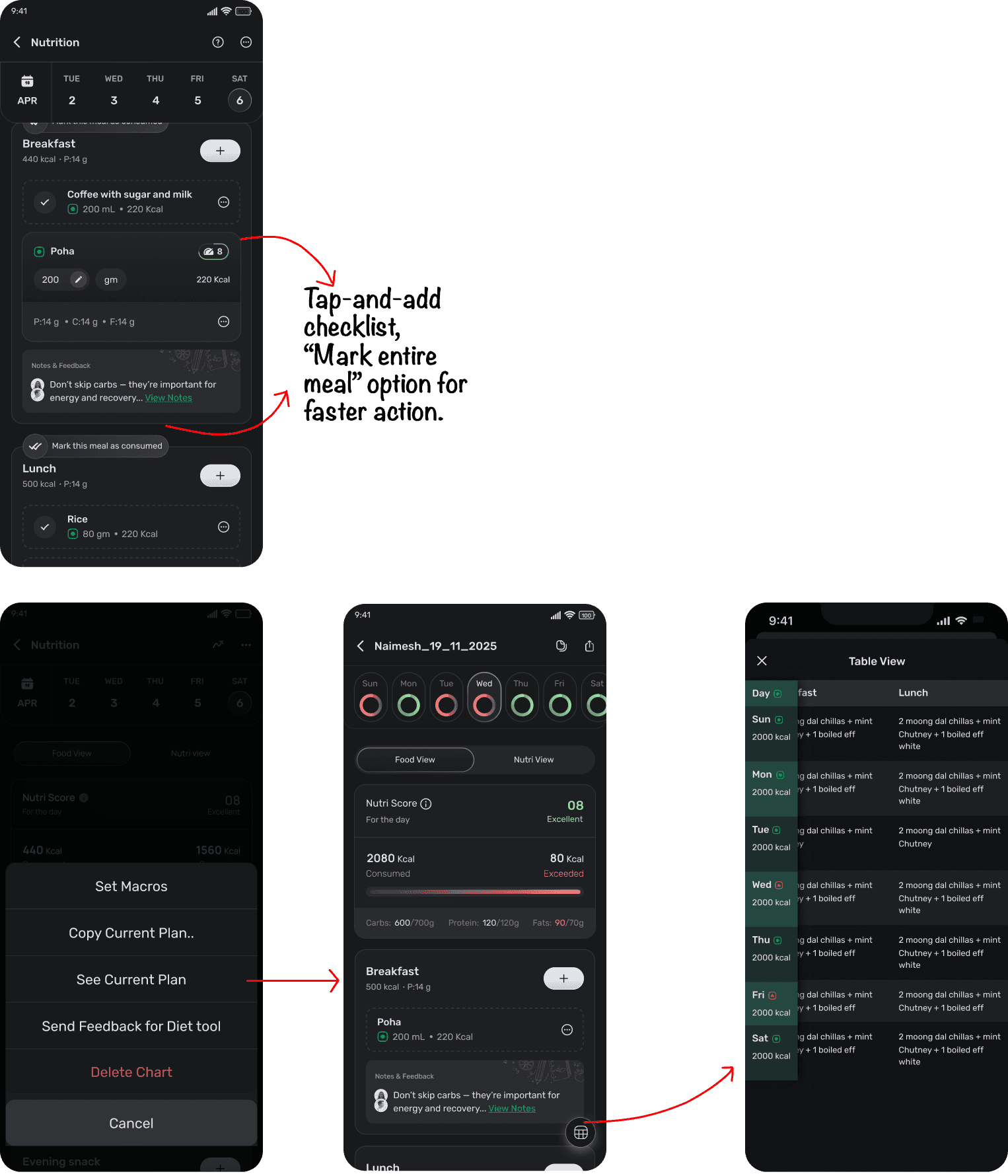
06/B — The shipped experience
Coach experience
Chart Creation
We’ve streamlined the chart creation process to significantly reduce the time coaches spend on creating charts. By enhancing usability for both template-based and manual methods, we’ve made it easier than ever. Manual chart creation is simple as adding individual food items, just like the user experience, with template options showcased below.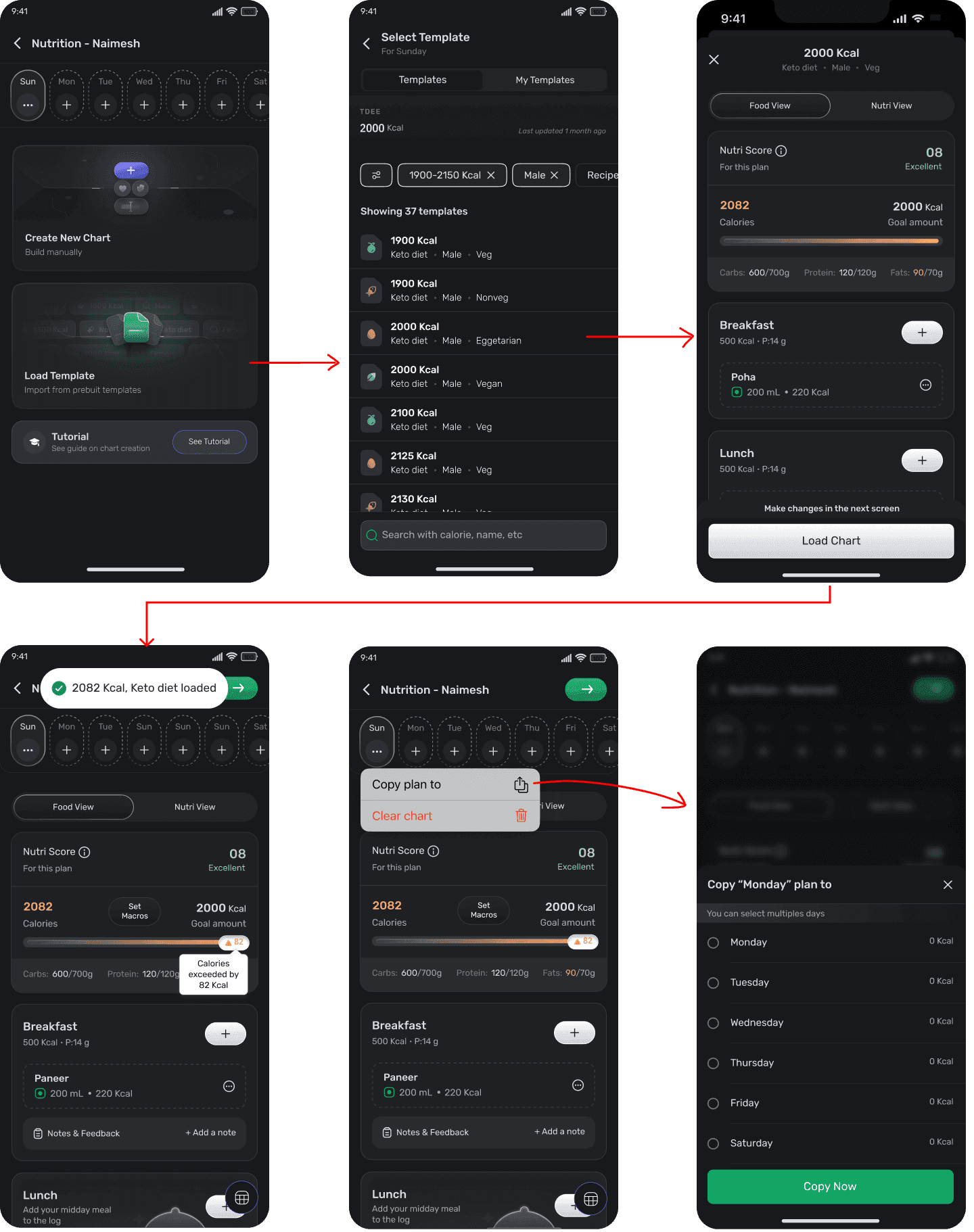
Boosting confidence with engaging tutorials.
Launched tutorials tailored for coaches, allowing them to easily access guides whenever they have questions about the new process. This component is designed for users but activated through different triggers, enabling us to expand its use cases effectively.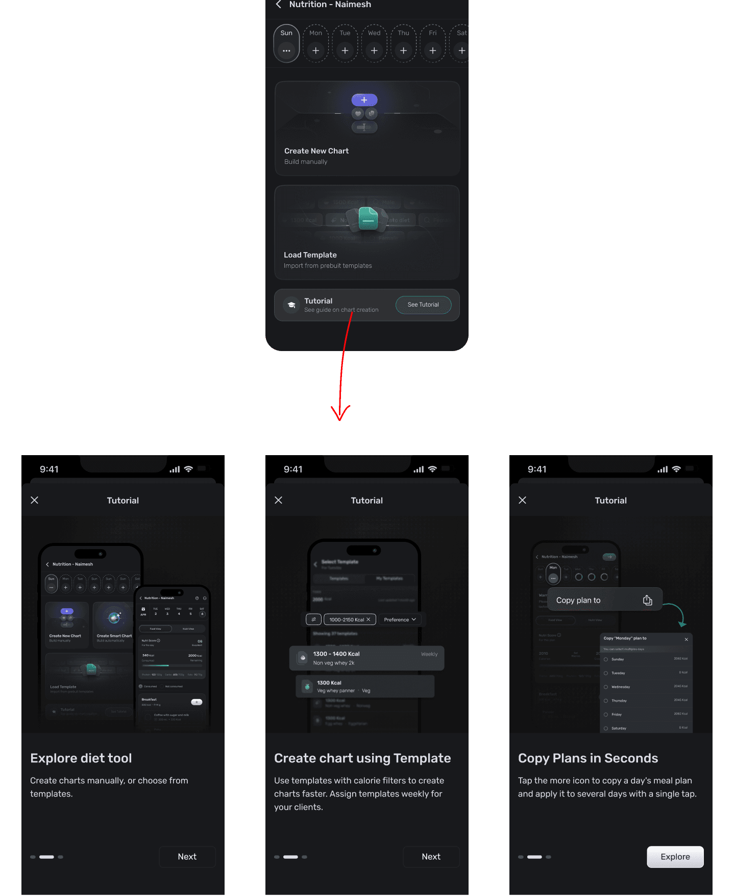
06 — What happened
I planned the rollout. I under-planned the handoff.
We couldn’t A/B test. Engineering didn’t have the bandwidth, and the legacy code had to be replaced regardless. So there was never a second version to compare against.Instead of controlling risk with an experiment, we controlled it with exposure: a phased rollout, ramped gradually to 100% rather than shipped to everyone at once.Where it slipped
The problem wasn’t the interface but that coaches had to fill out a full week instead of one chart, without training. The top support question was: how do I create a single plan?The AI smart chart feature, meant to ease the workload, had been put on hold. I made a choice that wasted coaches’ time, aware that a solution was not coming soon.
"The old tool was super user-friendly. I could create one chart and assign it to all the days effortlessly. Please bring it back!"
The fix : Added post-launch
After discussing with coaches, we came to a conclusion that we needed a solution which will cater both types of coaches - the ones who wanted seven differentiated days, and the ones who didn’t.Copy to all days - build one chart, apply it across the week. Designed and shipped in three weeks.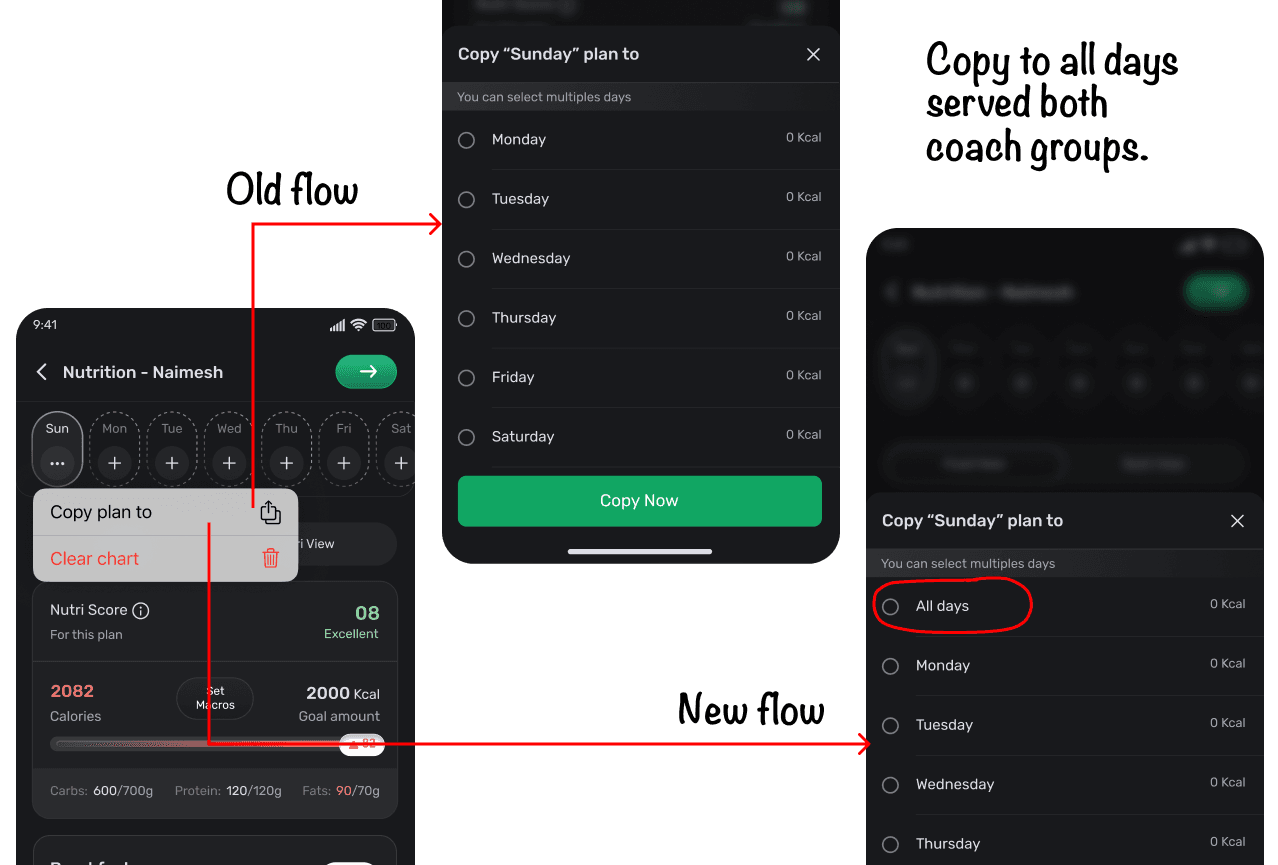
The outcome
D7 moved. D1 didn’t. Both were the right result.
1.12%
D1 retention.Essentially flat — and it should have been. Nothing we shipped changed the first session.22%
D7 retention improved.A return-value bet shows up on day seven, not day one.46%
of users logging via AIThe paths that avoid a catalogue search took half of all logging.On attribution. There was no A/B test and no control group. These are movements observed after launch, not effects I can attribute to the redesign.On coach time. Coaches who were already building differentiated daily charts told us on calls that the new flow saved them time. We didn’t instrument it, so that’s exactly where the claim stays.
What I’d instrument if I ran this again
- 1.Search zero-result rate — the sharpest proxy for a catalogue that’s missing items. A zero-result search is a missing food.
- 2.Chart-creation time, split by coach segment — the number whose absence let the coach cost stay invisible until it arrived as tickets.
- 3.There was no experiment available; there should still have been a baseline.
07 — Reflection
What I’d do differently.
1
Ship the safeguard with the decision, or don’t ship the decision yet.
The seven-day chart went out with its mitigation already parked. Post launch tickets weren’t a surprise; they were arithmetic.2
Enablement routed through someone else is a dependency, not a plan.
Training went through coach managers and I didn’t track whether it landed. There was no route back from them to us, so we found out from tickets.I designed for one coach population where there were two.The segmentation only appeared in post-launch tickets. “Copy to all days” was the the fix - it should have been the design.
The lesson for me was that sometimes the constraint isn’t finding or communicating the right solution. It’s designing a graceful path between the ideal experience and what the organisation can realistically ship.